No Added Sugar
A Fresh Take on Directional Childrenswear
The Project
No Added Sugar, a pioneering childrenswear brand known for its bold and directional designs, approached Laura Brown Studio to create a suite of assets, including editorial design, web visuals, newsletters, and collateral. The task was to craft a cohesive visual identity that complemented the brand’s playful yet polished aesthetic while standing out in a competitive market.
The Inspiration
The ideation process was rooted in nostalgia, drawing on the timeless appeal of classic gymnasium aesthetics. Hardwood floors, vintage gym equipment, bold stripes, and clean geometry informed the visual direction, creating an energetic and refined design language. This aesthetic perfectly aligned with No Added Sugar’s ethos—where childhood energy meets sophisticated style.
Editorial Design
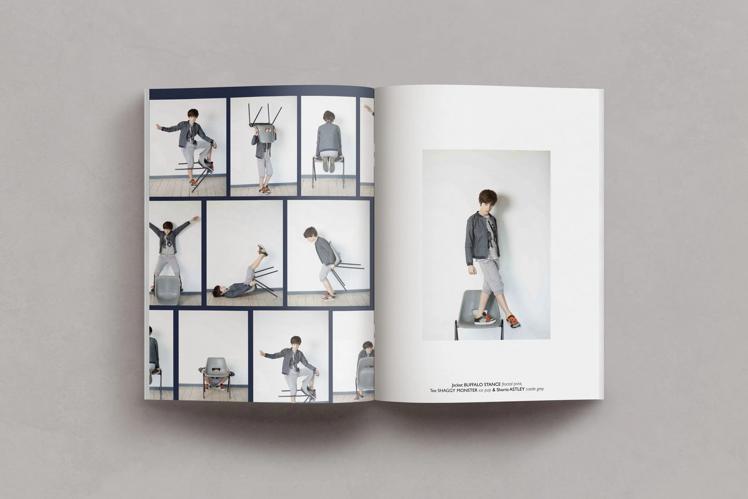
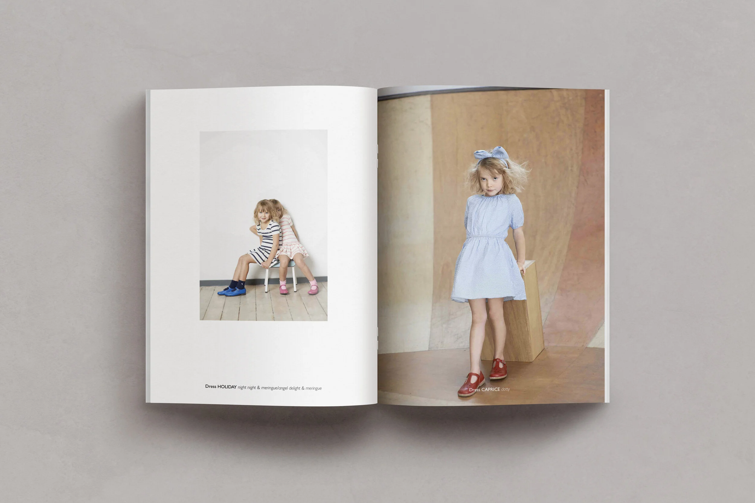
The editorial layouts celebrated the brand’s unique pieces while echoing the gymnasium-inspired theme. Striped borders reminiscent of gym mats framed each page, while typography mirrored the vintage sports hall's bold, utilitarian signage. The design struck a balance between structure and play, creating spreads that felt dynamic and engaging.
Web Assets and Newsletters
For the digital experience, the studio carried the gymnasium aesthetic into web assets and newsletters. Graphic elements like bold lines and clean typography were paired with high-energy photography, ensuring the brand’s personality shone through every digital touchpoint.
Newsletters featured editorial-style layouts that treated each product like a hero, with oversized headlines and playful callouts inviting engagement. These designs were as functional as beautiful, driving clicks and conversions while reinforcing the brand’s visual identity.
Collateral
Printed collateral, from lookbooks to hangtags, extended the design language into the physical world. Rich textures and tactile finishes evoked the feel of vintage gym equipment, creating a tangible connection to the campaign’s inspiration. Details like stitched borders and embossed typography added depth and authenticity to the pieces.
The refreshed design suite positioned No Added Sugar as a leader in directional childrenswear, blending nostalgia with modernity to create a visual identity that resonated with both parents and children. The gymnasium-inspired aesthetic provided a cohesive narrative that unified the brand’s online and offline presence, elevating its appeal and strengthening its market position.
"The gymnasium inspiration offered a perfect metaphor for childhood—where play and discipline coexist. Designing for No Added Sugar allowed us to channel that energy into a visual identity that feels fresh, engaging, and unmistakably theirs. It was about creating a world that speaks to both the sophistication of the brand and the joy of its audience." – Laura Brown