There is a particular satisfaction in getting something to look right. The space around a word. The character of a typeface. A colour that brings everything else into focus. I can spend a surprising amount of time on these things, moving a heading a few millimetres and moving it back again. Countless memes in Design culture are about this very thing.
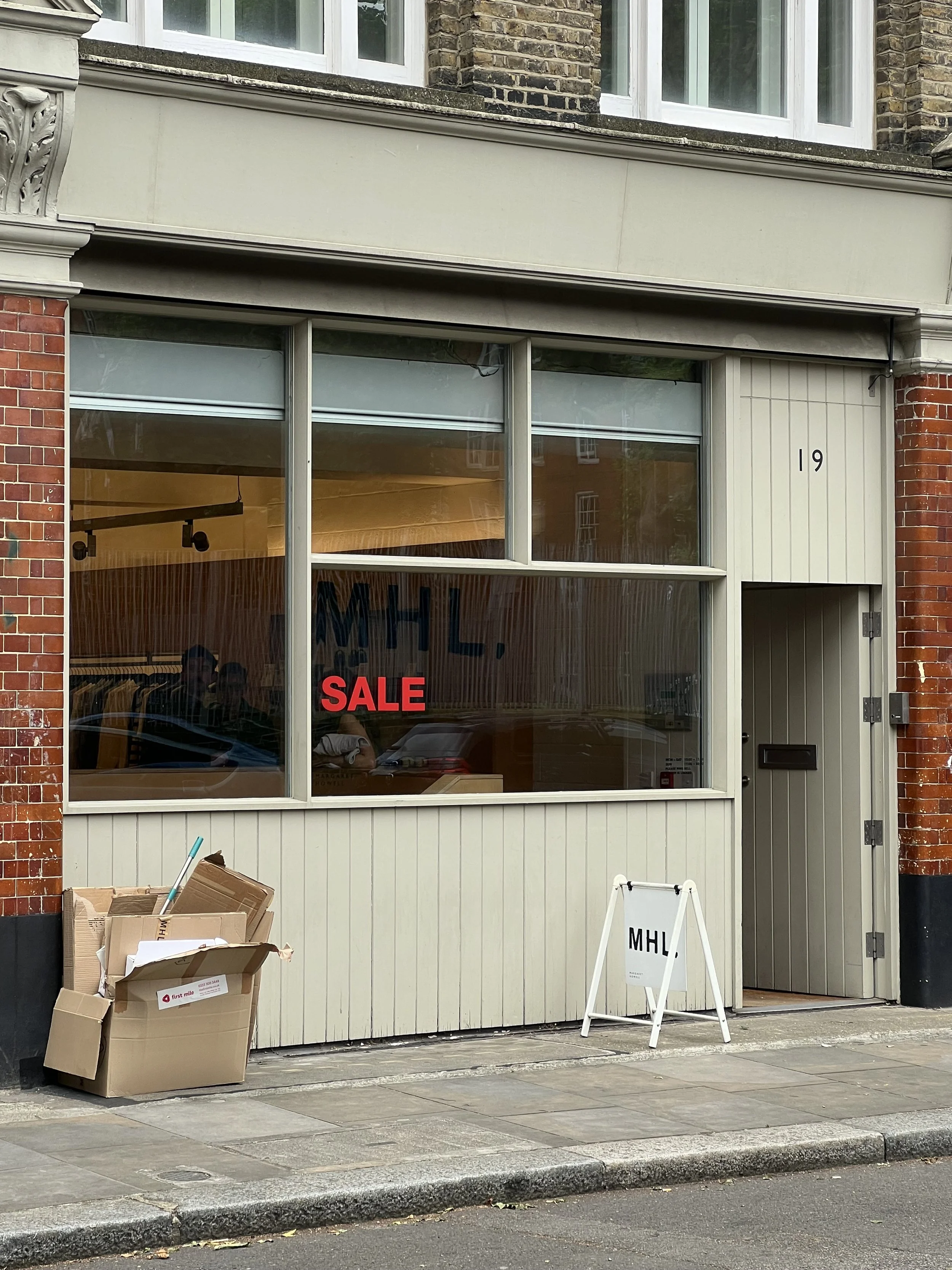
This attention is part of why I love design. But I have been thinking about where it falls, and what might remain outside it. A page can be beautifully composed and difficult to read. A shop can feel inviting from the pavement and be impossible to enter. A booking form can look straightforward to the person who made it, while asking far too much of someone trying to use it.
Someone has considered the experience. The question is whose.
In my own work, I often return to ideas of recognition and belonging: the feeling that a place, an object or a piece of communication understands something about you. There is value in this specificity. A small shop has its own character; a studio has a point of view. We recognise ourselves in particular things.
Yet I need to keep one distinction in view. Choosing a sensibility is one kind of decision. Creating a barrier to participation is another. A place can know exactly who it is and still make room for people whose needs its owner has never had to consider.
That requires a wider kind of attention.
Inclusive is a lovely word. Welcoming, generous, reassuring. It sits very comfortably in a brand document, and it is easy to say without changing very much.
We might describe a shop as somewhere for everyone, then leave someone guessing whether they can get through the door. We might write warmly about community, then publish the invitation as an image with no accessible text. We might create a beautiful website that makes finding ordinary information unnecessarily hard.
The intention may be generous. The experience can still be excluding.
That gap interests me, partly because my work sits in it. Branding makes promises. Design helps determine whether people can experience what has been promised.
If we say everyone is welcome, the practical details have to carry some of that welcome.
Much of creative work begins with instinct. I notice something, make a connection, try a direction. Over time, you develop an eye and learn to trust it.
But having an eye for design doesn’t mean I know how someone else experiences it.
What feels beautifully restrained to me may be difficult for someone else to read. What I find playful may be confusing. A detail
I barely notice may stop another person from completing a task.
I need to be careful not to treat my own ease as evidence.
An imagined person stands behind every design decision. Often, unless we actively question it, that person is much like us: using
the same kinds of devices, understanding the same cues, and able to see, move, read, and process information in ways we take for granted.
We may give them a different age, income or taste in interiors. The deeper assumptions remain.
For me, thinking more seriously about inclusivity means becoming more curious about those assumptions, and less attached to them.
I’ve been reading the work of the Research Institute for Disabled Consumers, or RiDC, a charity led by disabled people that researches the accessibility of products and services with disabled and older consumers.
Its approach has made me think about whose knowledge shapes the work.
RiDC’s Making Everybody Mean Everybody strategy places disabled people’s lived experience at the centre of decisions. That means people having influence over what is researched, what needs to change and how solutions are developed.
For a designer, this asks something quite specific. It asks us to make space for knowledge we do not possess and to let that knowledge alter the work. I find this useful and challenging in equal measure. It gives us something much more substantial than guesswork, but listening properly might mean changing an idea I like.
An invitation to contribute means very little if the answer cannot affect the outcome. By the time a design is nearly finished, there may be precious little space left for someone to tell us that we have solved the wrong problem.
So the listening needs to begin while the brief is still taking shape.
I think accessibility belongs in the first conversation.
Alongside questions about ambition, audience, and character, we should ask who might encounter barriers, what we already know, and whose experience we need to understand better.
That has consequences for the scope, budget, and time we allow. Involving people properly means making participation accessible, paying for their expertise and leaving room to act on what they tell us.
For my own practice, I want to use research such as RiDC’s to ask better questions, identify assumptions and make more informed decisions. I also need to recognise where published insights stop short of answering a particular project’s needs, and where direct involvement or specialist support is needed.
Reading something valuable is only the beginning. I need to give it somewhere to go.
I’m particularly drawn to independent shops, studios and places with character. Places where someone has thought about the flowers on the counter, the paper around a purchase, the shade of the front door.
I love that care, and I want it to extend to the information someone needs before visiting, whether they can read the menu, and the way they make an enquiry. To the practical arrangements and choices that make a visit possible.
RiDC’s Re-Imagining Retail research considers how barriers accumulate across a shopping experience. It is a useful reminder that people experience the whole journey, including the awkward joins between a website, a service and a physical space.
Something can look inviting and still ask a person to do an unreasonable amount of work to participate.
Inclusivity, to me, means taking responsibility for more of that work ourselves.
I still want expressive typography, unusual colour, wit and a little surprise.
I also want to question the idea that making something easier to use will somehow make it less interesting. There is plenty of creative work in finding a distinctive design that remains legible, understandable and usable.
People will need different things. Sometimes the answer will involve options. Sometimes it will require a compromise. We need technical checks, people’s experience and the humility to keep revising.
The aim is to give more people the freedom to take part on their own terms, without having to be grateful for an exception.
That feels like a more demanding definition of welcome. It asks something of the brief, the process and the finished work. I want
to bring the same curiosity to this that I bring to the visual work, and be willing to change something I like when the evidence
asks me to.
A heading can always move a few millimetres. The more consequential adjustment may be to the person I had in mind when I placed it.