Annabel McKillop
Visual Identity for a Stylist and Visual Merchandiser
The Client
Annabel McKillop is a stylist and visual merchandiser whose work blends creativity with commercial acumen. With a career spanning iconic British retailers like The Conran Shop, Caramel Baby and Child, and Liberty, Annabel’s craft is rooted in retail spaces' physical, tactile, and ever-changing nature.
The Brief
Annabel’s work is often ephemeral—displays that exist only for a moment, installations that flex and adapt to evolving briefs, budgets, and tastes. The challenge was creating a brand identity that reflected this dynamism while celebrating her craft's tangible, hands-on elements.
Approach
The design process began with a deep dive into Annabel’s world. A key moment came when Annabel shared her neon-pink, sticker-filled Filofax—an artefact that perfectly encapsulated her vibrant and practical approach. The direction became clear: the identity needed to feel tactile, lively, and endlessly adaptable.
Design Highlights
Logo and Visual Device
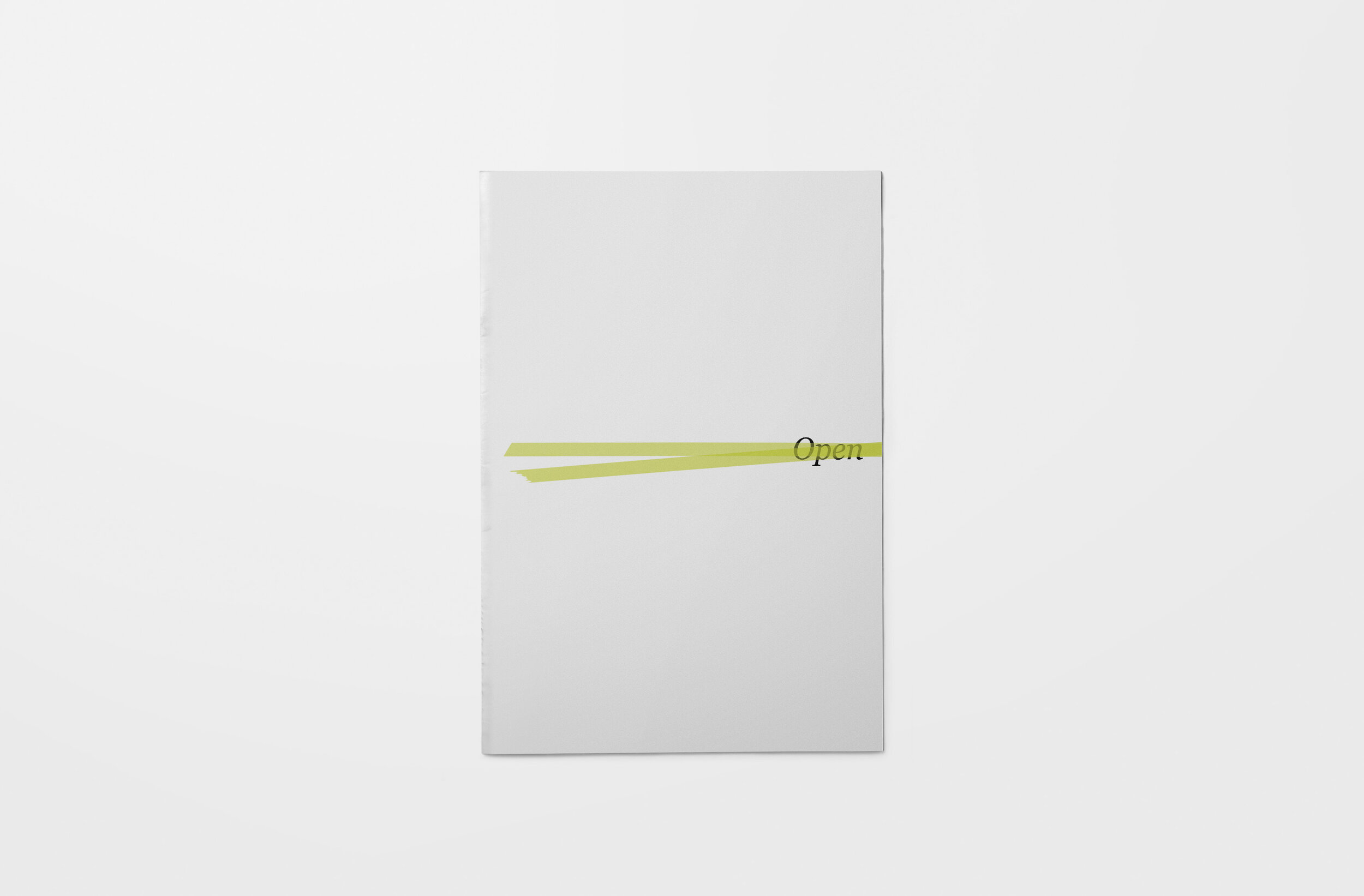
The logo incorporates a recurring motif inspired by Japanese washi tape—a tool synonymous with flexibility and creativity. Known for its durability, versatility, and residue-free adhesive, washi tape became the perfect metaphor for Annabel’s work. It appears throughout the brand identity in various widths, textures, and patterns, reflecting the adaptable nature of her craft.
Website and Collateral
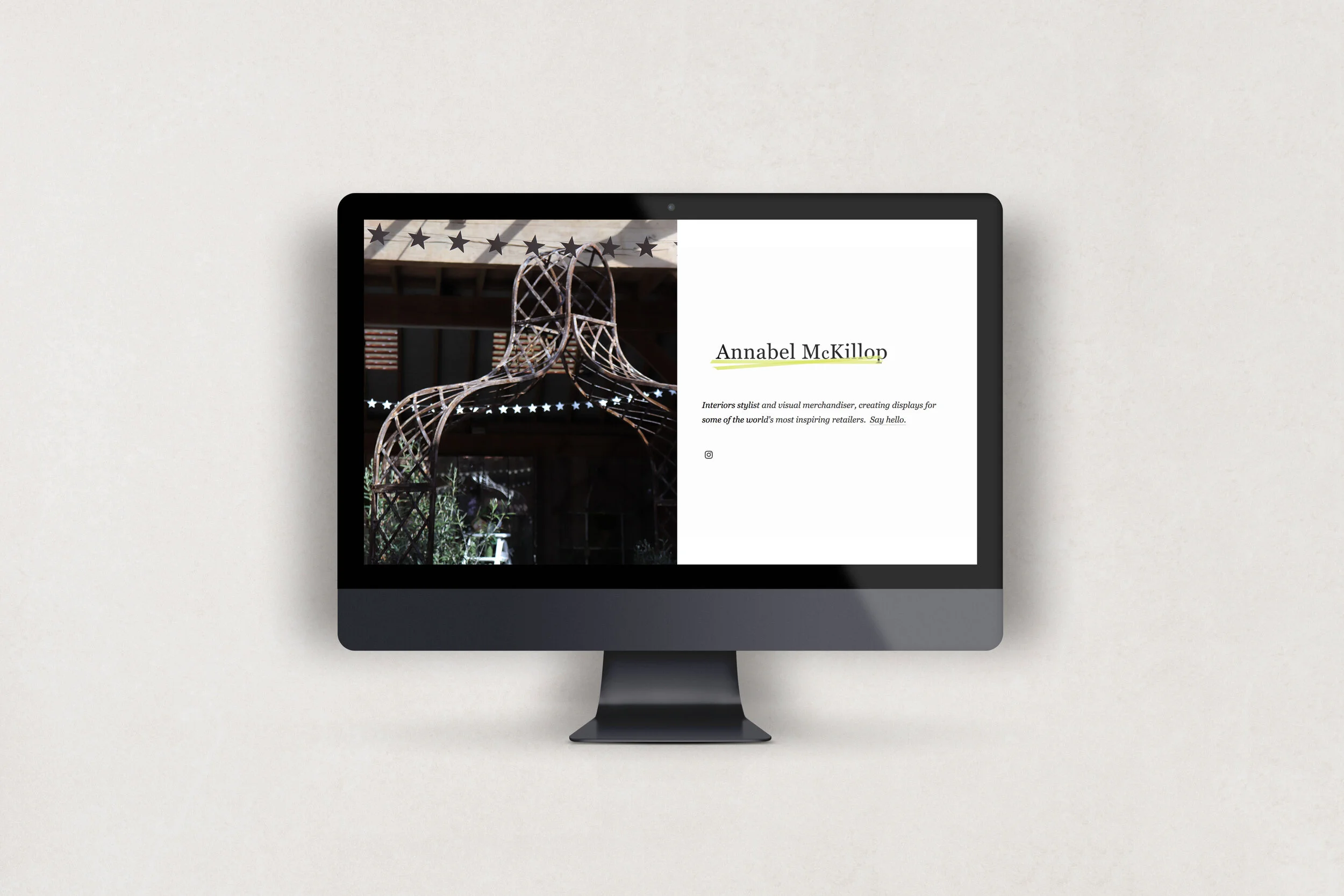
Annabel’s portfolio website features a bold strip of neon tape across its design, echoing her playful and practical aesthetic. The tape motif extends to printed collateral, creating a cohesive, striking visual language that feels tactile and professional.
Colour Palette and Typography
A vibrant palette of neon brights and textured finishes captures the energy of Annabel’s work. Paired with clean, modern typography, the identity balances playfulness with sophistication, reflecting her practice's duality of creativity and commercialism.
The Result
The new identity encapsulates Annabel’s ability to create striking, memorable experiences while adapting fluidly to the needs of her clients. It celebrates her work's physical, hands-on nature, positioning her as a creative force in the world of visual merchandising and styling.
"Laura took one look at my overstuffed, sticker-filled, neon-pink Filofax and instinctively knew the direction of the look and feel from there."
The brand identity for Annabel McKillop transforms the ephemeral nature of her craft into a lasting impression, celebrating the energy, adaptability, and creativity that define her work.