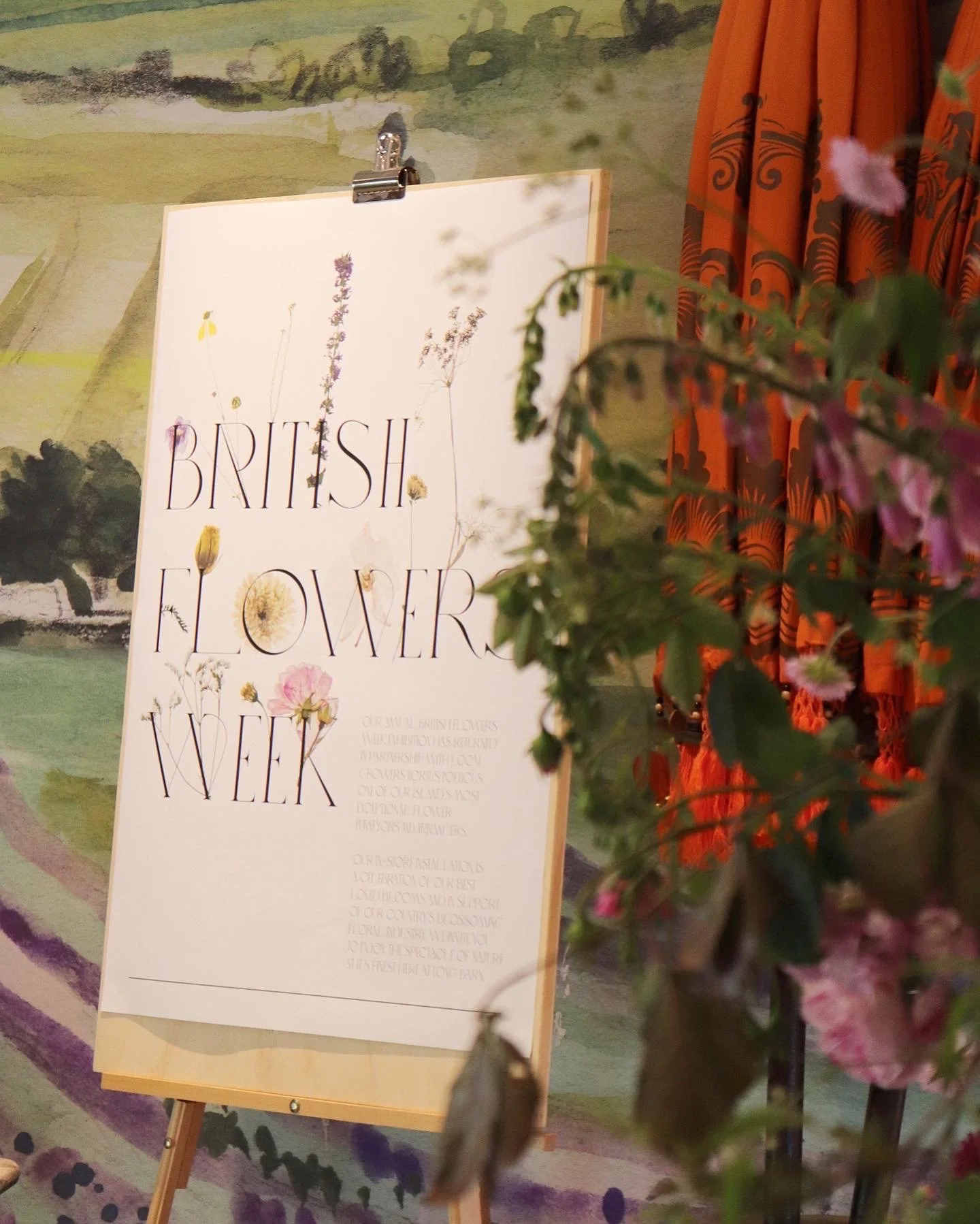
British Flowers Week
Celebrating Ten Years of British Blooms
In its tenth year, British Flowers Week—curated by @marketflowers—became a quiet triumph of design, honouring the ephemeral beauty of blooms through contemporary interpretation.
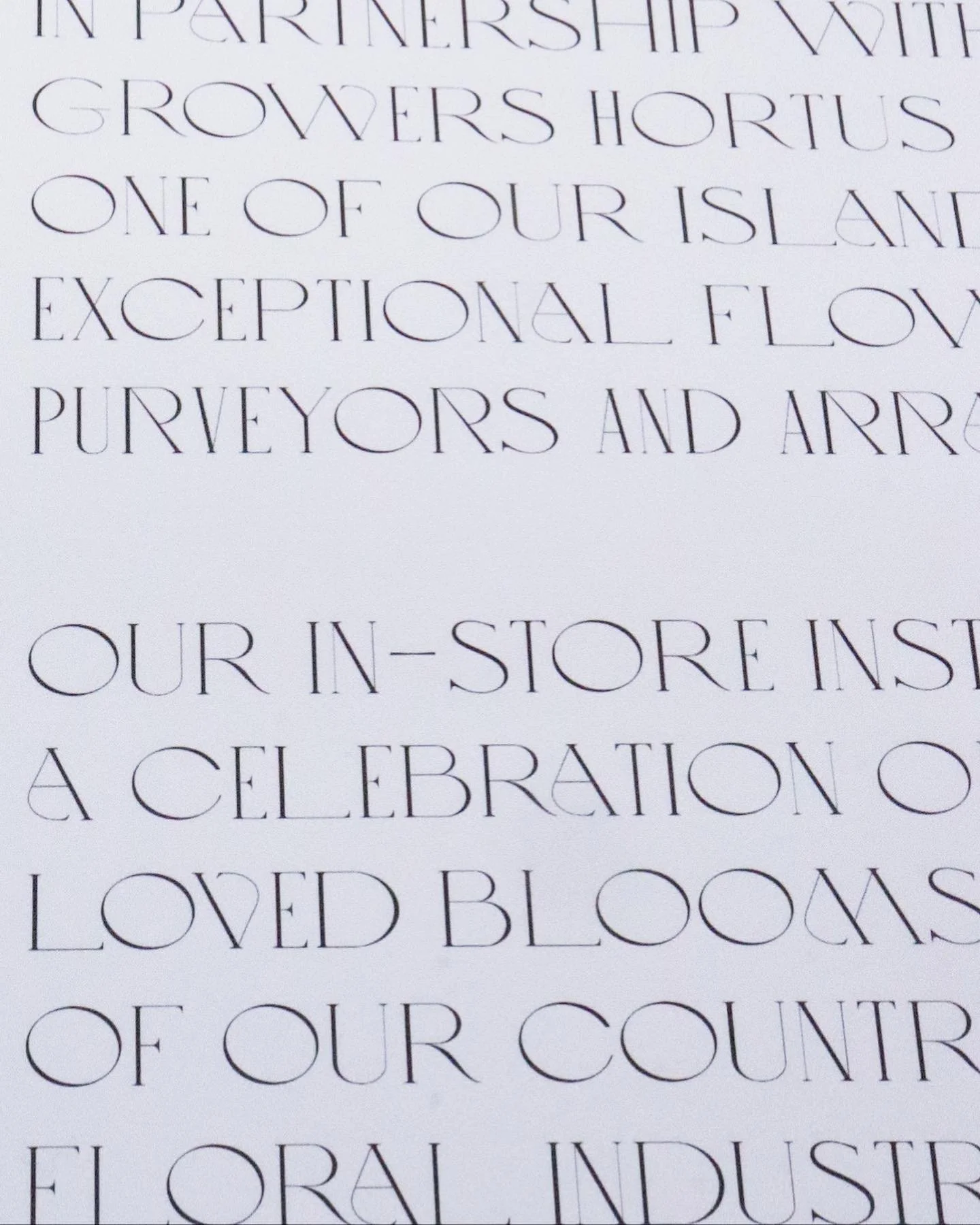
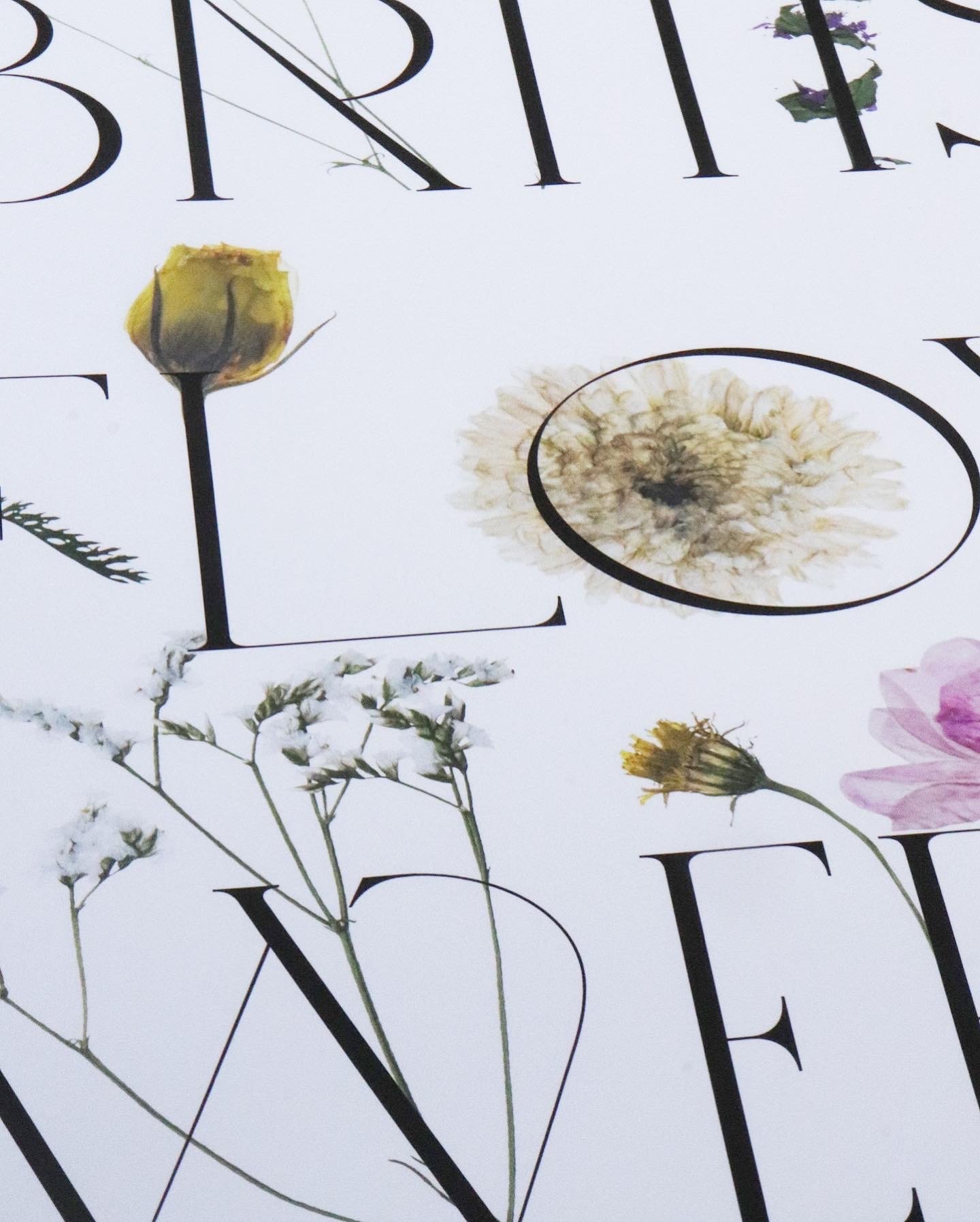
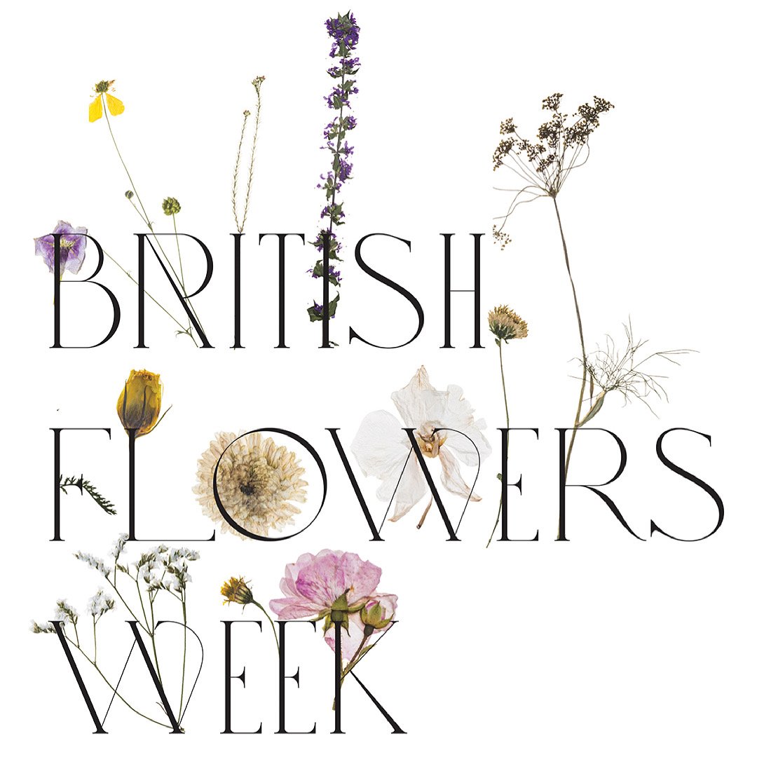
To mark the occasion, Laura Brown Studio created a commemorative poster that reimagined the pressed flower—not as a quaint keepsake, but as a modern emblem. Traditionally overlooked or sentimentalised, these flattened specimens were elevated through a restrained and graphic lens. Sparse, utilitarian typography offered a studied contrast: a frame of order around organic imperfection.
This deliberate juxtaposition—bold type against fragile petal—allowed each botanical to speak anew, revealing veins like ink strokes and edges like paper cuts. The design draws from the language of both herbarium and modernist poster, balancing softness with structure, memory with immediacy.
A celebration not only of flowers but of transformation, the piece stands as proof that even the most time-worn motifs can find fresh expression—when met with clarity, care, and typographic finesse.