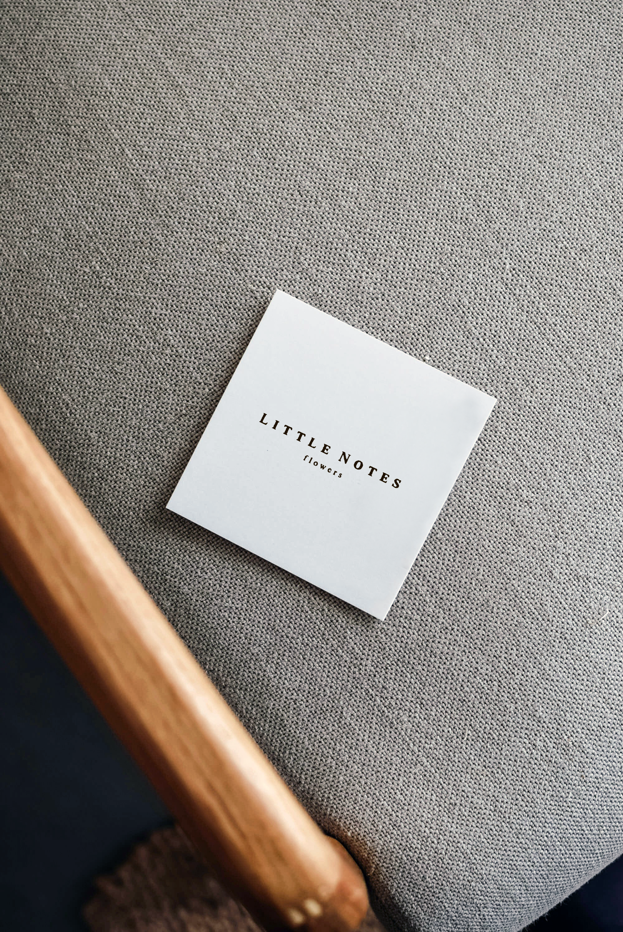
Little Notes Flowers
Brand identity, photography, website and collateral
Little Notes Flowers—three words that whisper intimacy. A quiet poetry of blooms and handwritten thoughts, woven gently together. From the start, this evocative name became the soul of the brand, guiding every creative decision.
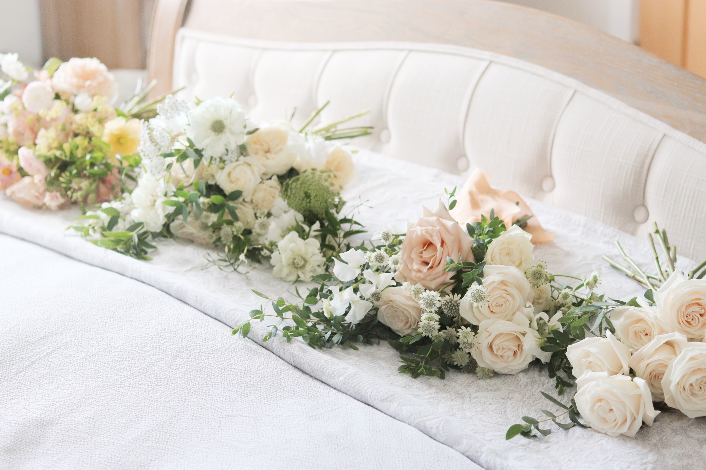
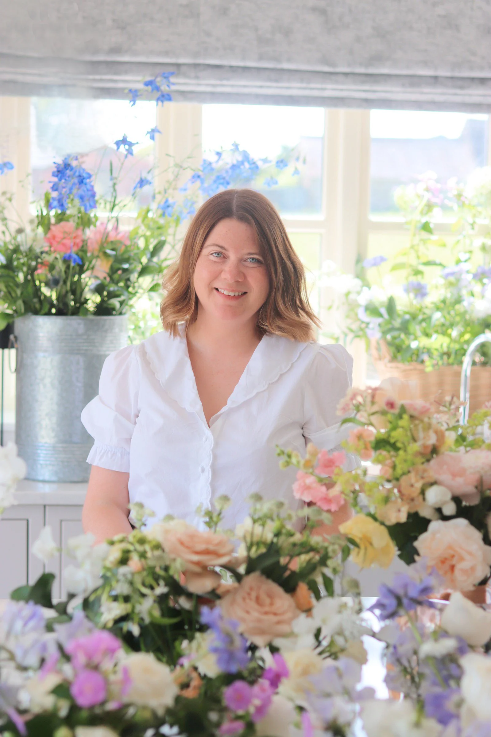
Set amid the soft hills and honeyed stone cottages of the Cotswolds, Vanessa shapes her floral designs with a graceful ease. Her dual identity—florist and mother—lent the brand a heartfelt authenticity, grounding beauty in both artistry and domestic warmth.
The mark emerged naturally, like ink meeting paper. Inspired by the delicate curves of petals and handwritten letters, the logo reflects the tenderness of personal messages slipped between stems. Typography was carefully chosen: a bespoke serif with letterforms reminiscent of an aged typewriter, imperfect yet precise, evoking words thoughtfully set to paper.
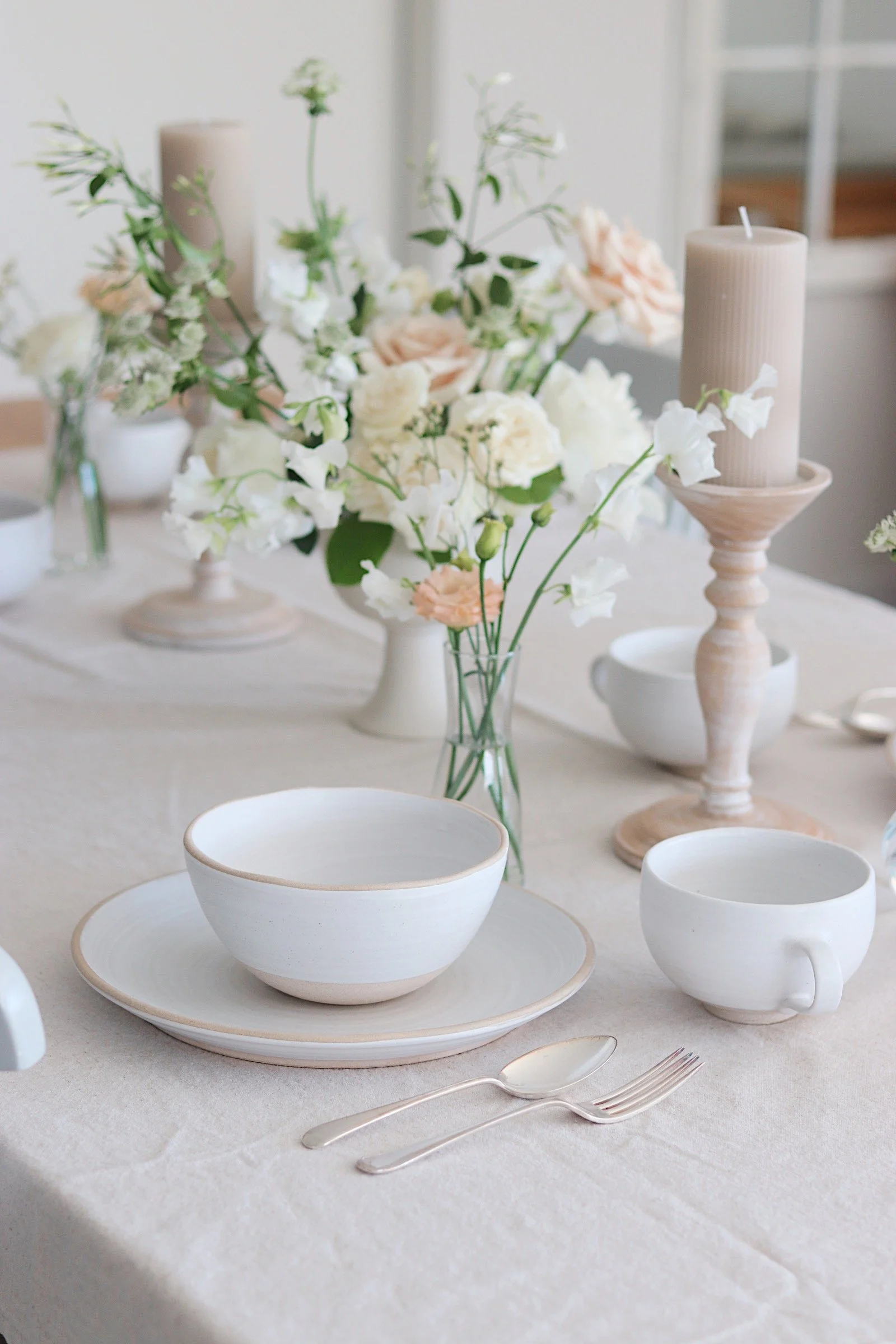
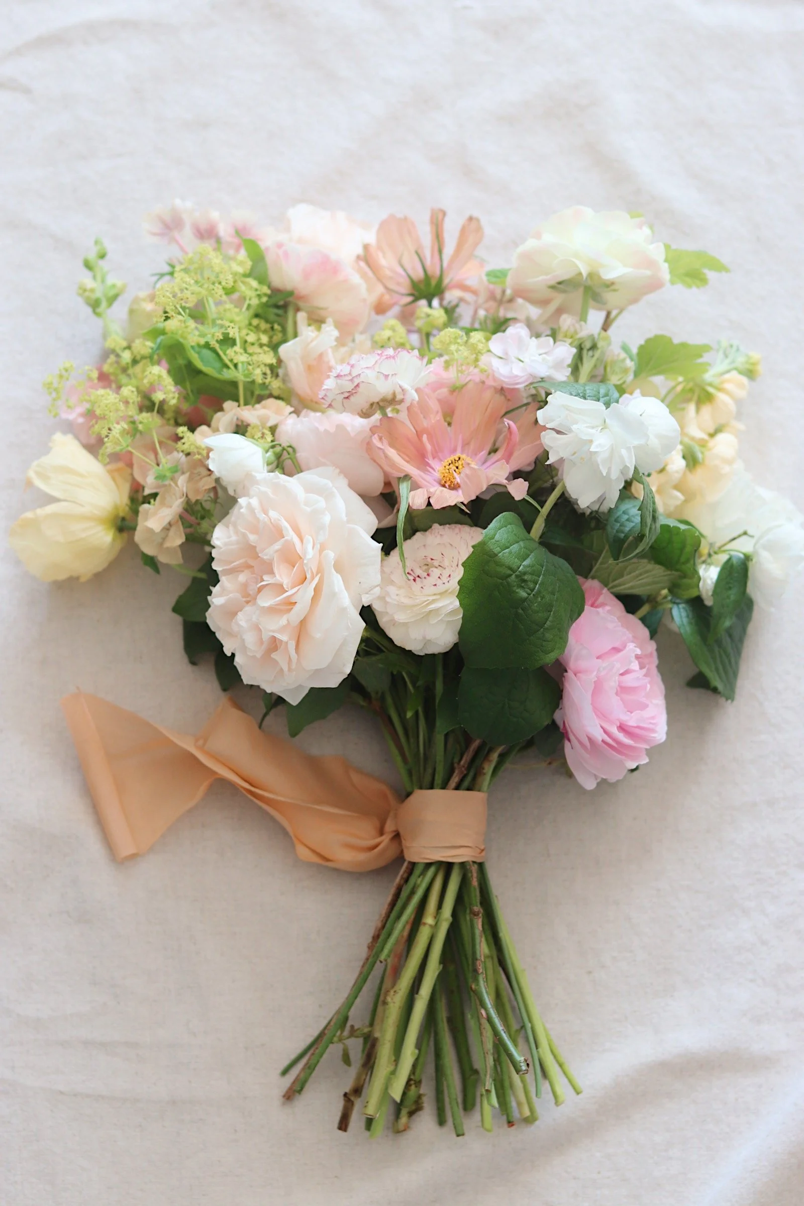
Colour speaks softly: muted blush, subtle greens, gentle creams—colours borrowed from Vanessa’s arrangements and the interior palette of a timeless Cotswolds home. Deep ink-blue accents add contrast, recalling handwritten notes on textured parchment.
Every detail carries meaning. Textured, uncoated papers and pressed flowers adorn the business cards, transforming each piece into a keepsake. Packaging patterns hint at scattered petals, poetic lines flowing across ribbons and wrap, extending the gentle intimacy of the brand.
Little Notes Flowers is more than a visual identity. It is a quiet celebration of flowers as personal poetry—a brand thoughtfully expressed, felt, and remembered.