Emilie Lindsten
Pause + Deep Rest
Editorial design for the artist’s guided yoga Nidra practice
Emilie is a Swedish/Italian artist now working under the name Nalini Ruha. She explores painting, drawing, writing, and landscape art in her work and facilitates meditation and sound bath classes. The boundaries between the practices and artworks are woven together. She has studied fine arts, fashion design, and social anthropology and lived in London for over a decade, exploring different roles within the creative industries - including a stint with the legendary Alexander McQueen - before focusing on her creative output solely.
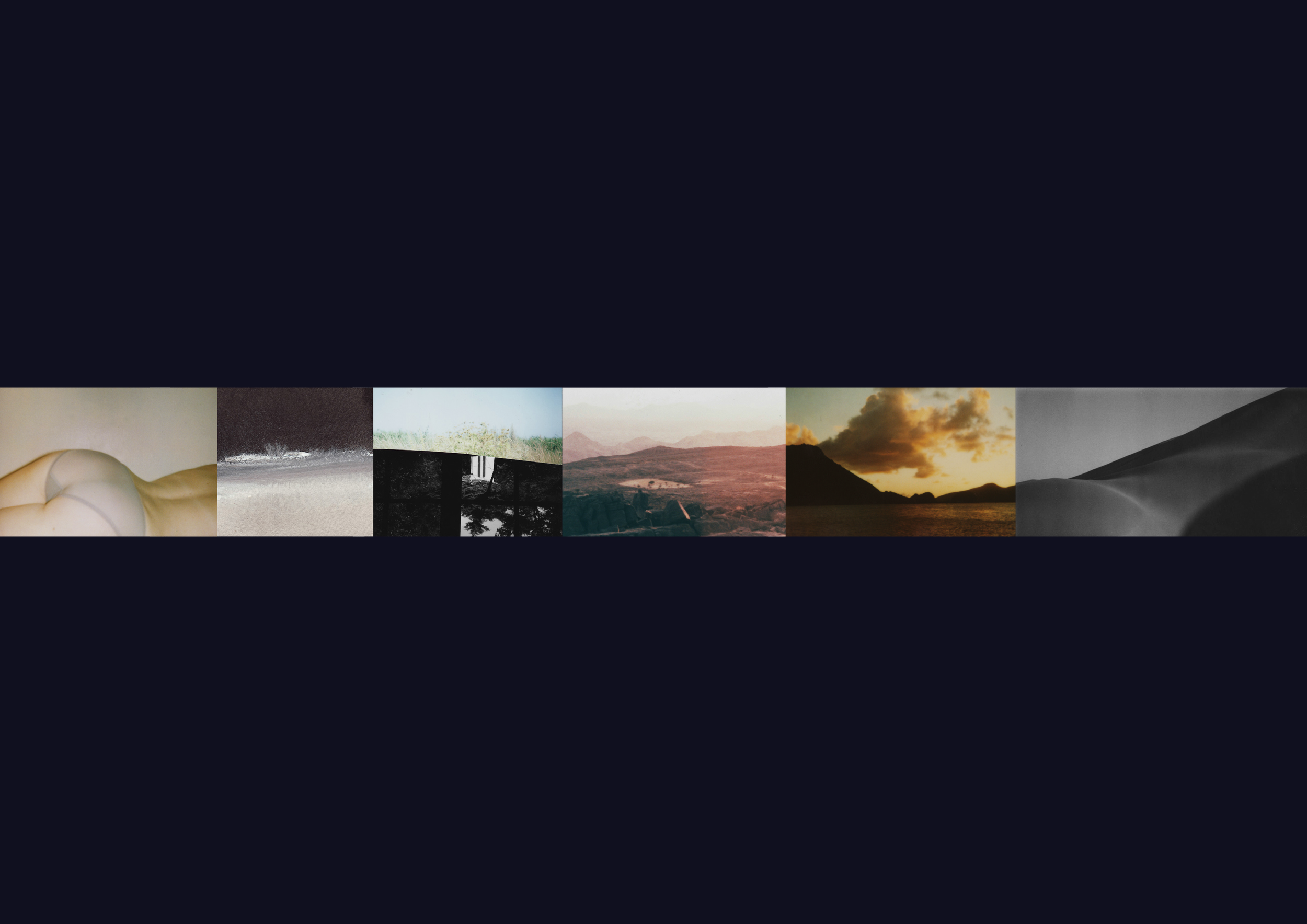
In the summer of 2021, the Studio was approached by Emilie to design packaging for two very special journeys - PAU-SE and DEEP REST, which are sold as digital products through her online shop. After a few inspiring zoom sessions - Emilie is based in a picturesque woodland enclave - talking through the ideas that inform her practice and having a good rummage in her archive of visual works, we settled on a solution that aimed to capture the essence of each course. It was fascinating to delve into Emilie's world - she has travelled extensively throughout her life; places that have left a deep mark on her and continue to influence her work are the Indian Himalayas and the Sahara desert. In addition, she has worked and taught workshops on somatic painting, movement, and yoga Nidra in London, Berlin, Italy, and Sweden.
Emilie's paintings and drawings seek to connect and explore gateways between the inner and outer worlds; in her art, she utilises colour and natural materials to create organic forms and textures created with spontaneous movements made as rituals and offerings for healing and reconnection. The design needed to function as a framework for her expressions across all forms - photography, sketches, poems, paintings, and movement. In addition, the design had to articulate movement, or lack thereof - rest and rhythm, pause and starts.
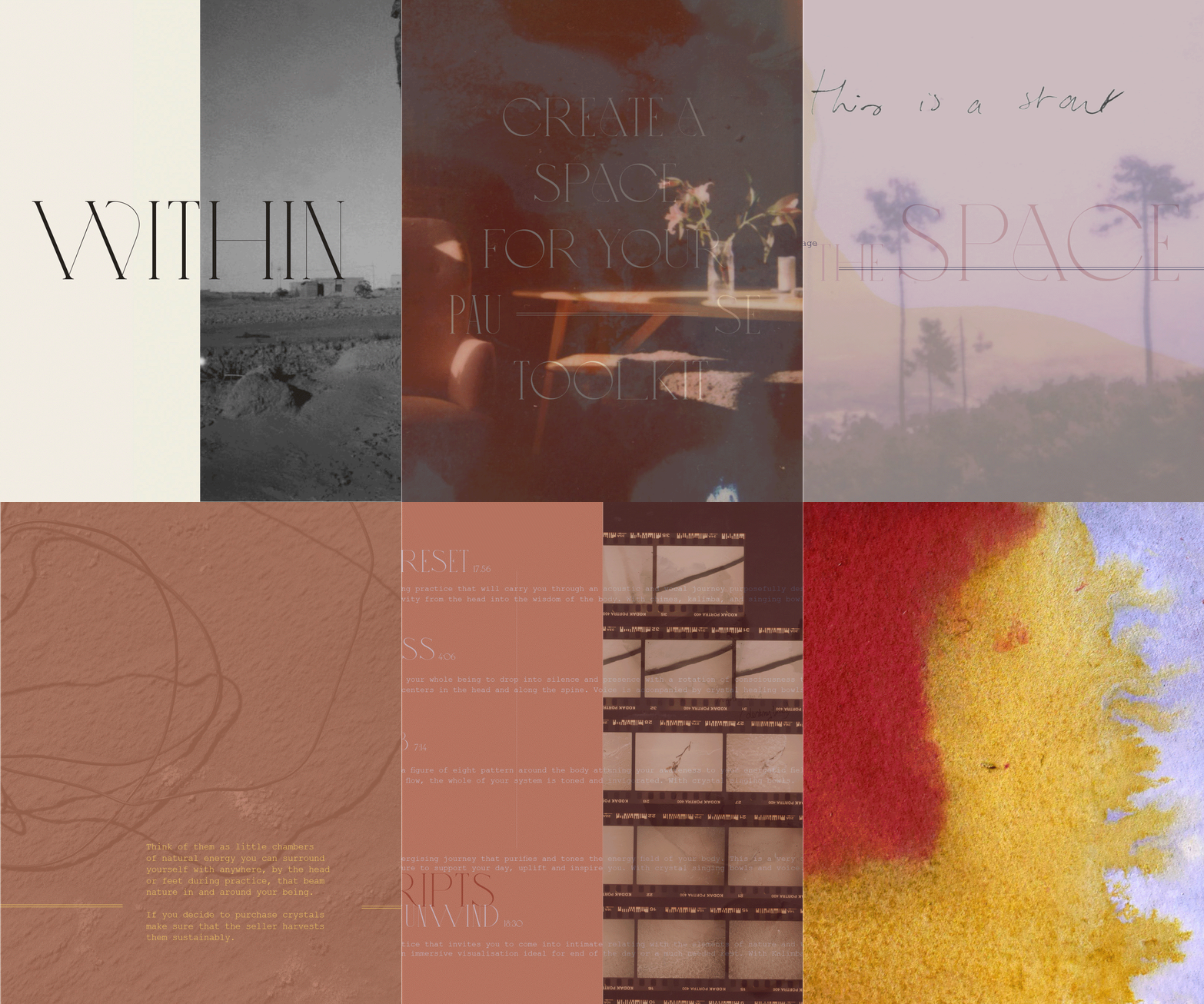
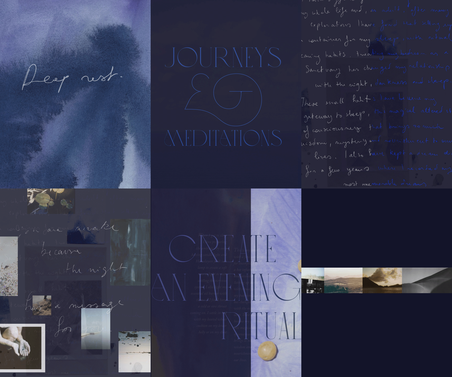
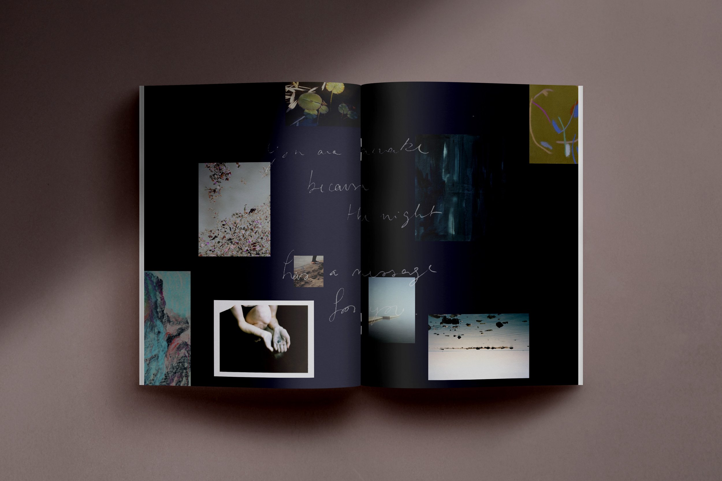
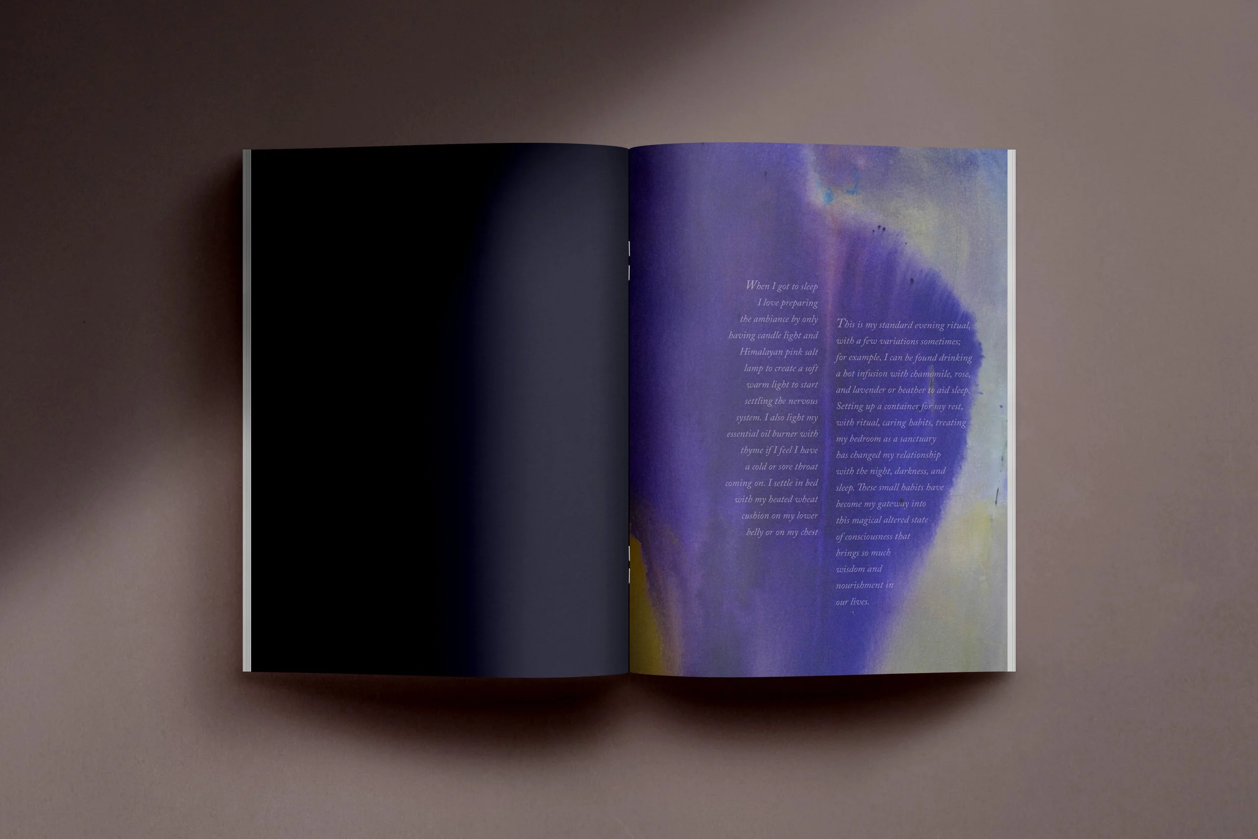
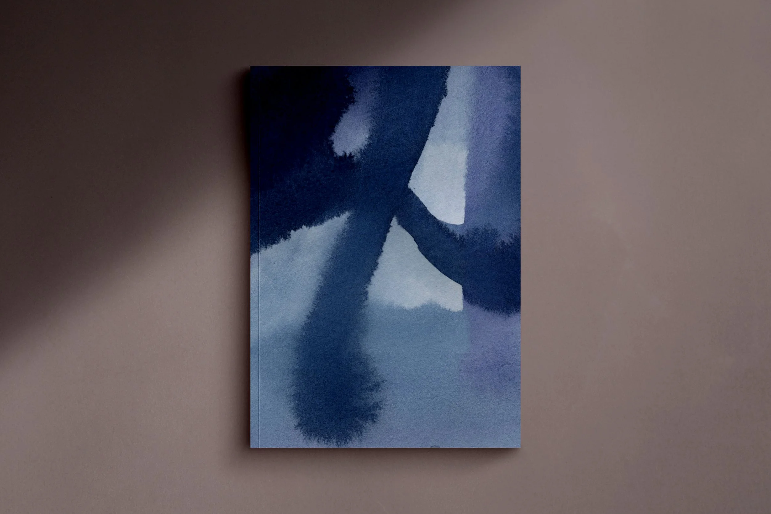
Laura designed a comprehensive suite of print and digital materials to support the marketing and sales of the bundles, which included beautiful printable booklets with original artworks containing ritual prompts and inspiration to support the participant's journey and five downloadable MP3 files. Each magazine's design language was inspired by the interplay of the artworks and the text, with bold typography and handwritten notes used throughout. These are used to emphasise words, give a contrast in pace and create layouts with real impact - a nod to the relationship between literature and the visual arts. Each magazine is infused with a rich distinct colour palette, evocative of the landscapes which have inspired Emilie's practice, warm tones of stone, sand, putty, and clay for PAU-SE, and saturated, inky watercolour washes for textural intrigue in DEEP REST.
In PAU-SE, you are invited to punctuate your day with a moment to relax with purpose, reset the senses and freshen your mind and body. So we rested on infusing the warm palette with type and images overlapping as if double exposed - creating storytelling through surreal imagery, juxtaposing with DEEP REST, daylight, and conscious reality needed to be a primary influence. The image choices made capture the natural oddities of light in a day that cause us to pause and take notice, such as the moment we accidentally look into the sun. As a result, your vision is flooded with flashes and colour. We also included a small hyphen to the word PAU-SE to further illustrate a 'break.'
In DEEP REST, you are called to surrender to sleep. The colours of the night invoke a sense of enveloping peace and calmness. We created a sigil for the cover that invokes a sense of magic and mystery and calls for our subconscious to awaken. The term sigil derives from the Latin sigillum, meaning "seal," and it is the root of many other English words such as "signature," "sign," and "signal." Here we are using a custom symbol as a visual representation of personal intention - our subconscious reads it as opposed to our conscious mind. By using images and symbolism, it's easier to move beyond our conscious mind and tap into something deeper and intuitive.
" Emilie has a beautiful eye and tender sensitivity to her surroundings, which shone through her archives of photographs, collages, sketches, and journal entries. It was a pleasure first to discover, assemble, and give form. Hopefully, my interpretation will offer her clients an additional element of joy to what is already a memorable experience. "
