Cabinet Cards
These Victorian photographic cards, commonly known as cabinet cards, occupy an interesting position between object and image. Produced from the 1860s onwards, and widely circulated by the 1870s, they were designed for display rather than storage. Their scale—larger than the earlier carte de visite—allowed them to function as both portrait and presence within domestic interiors.
They were not private objects.
Photography as surface
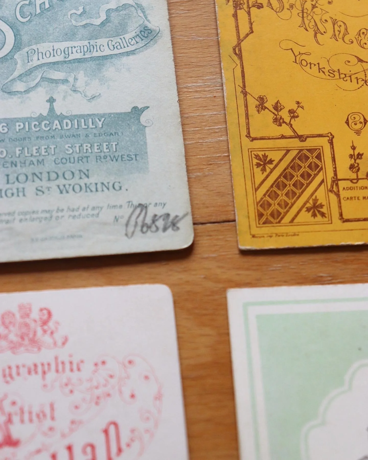
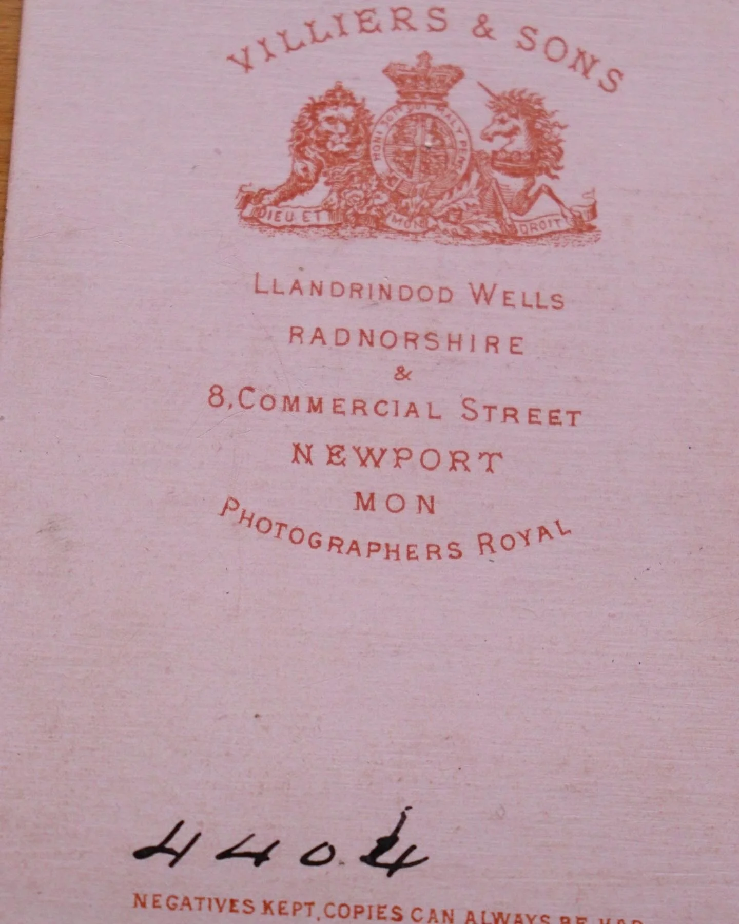
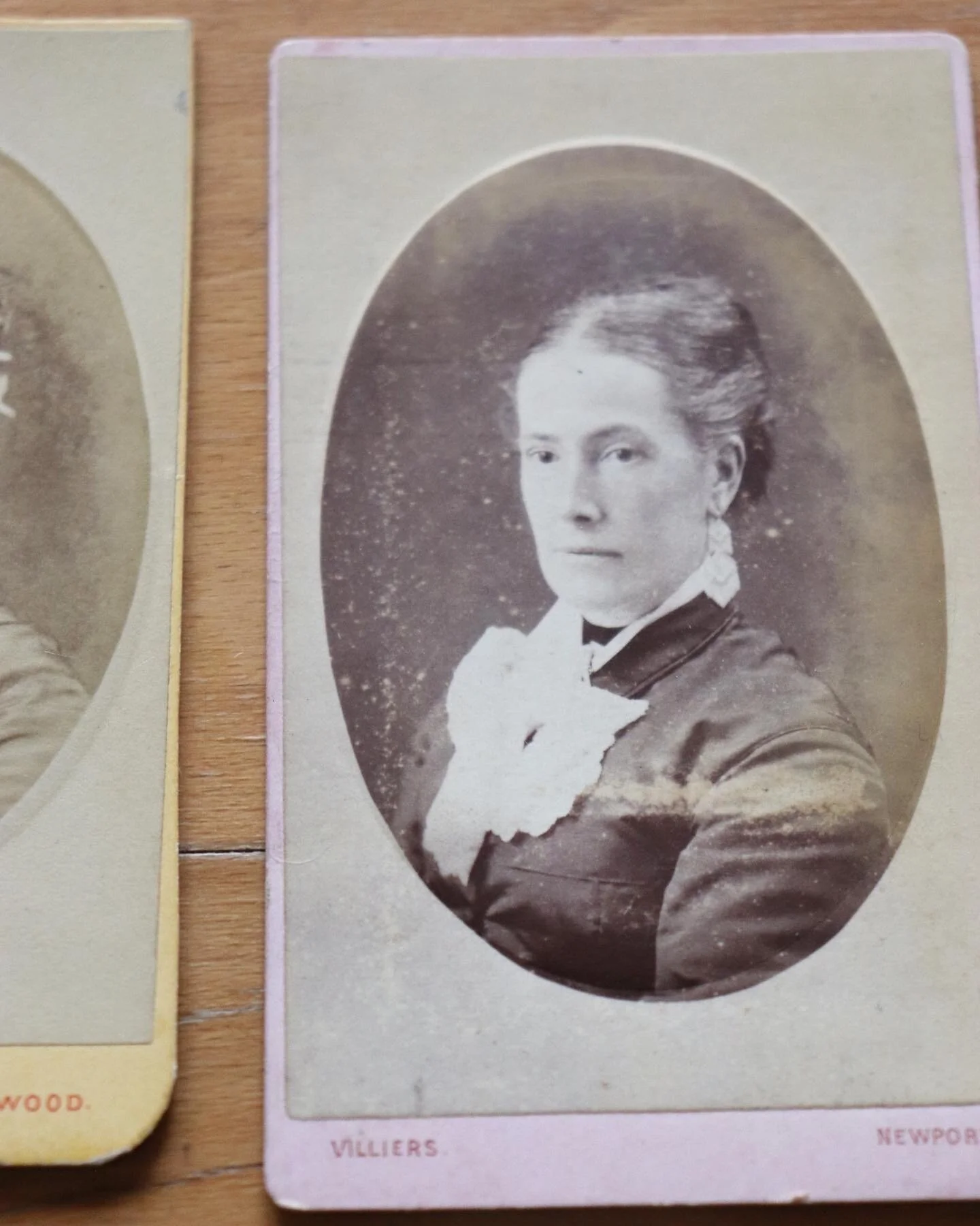
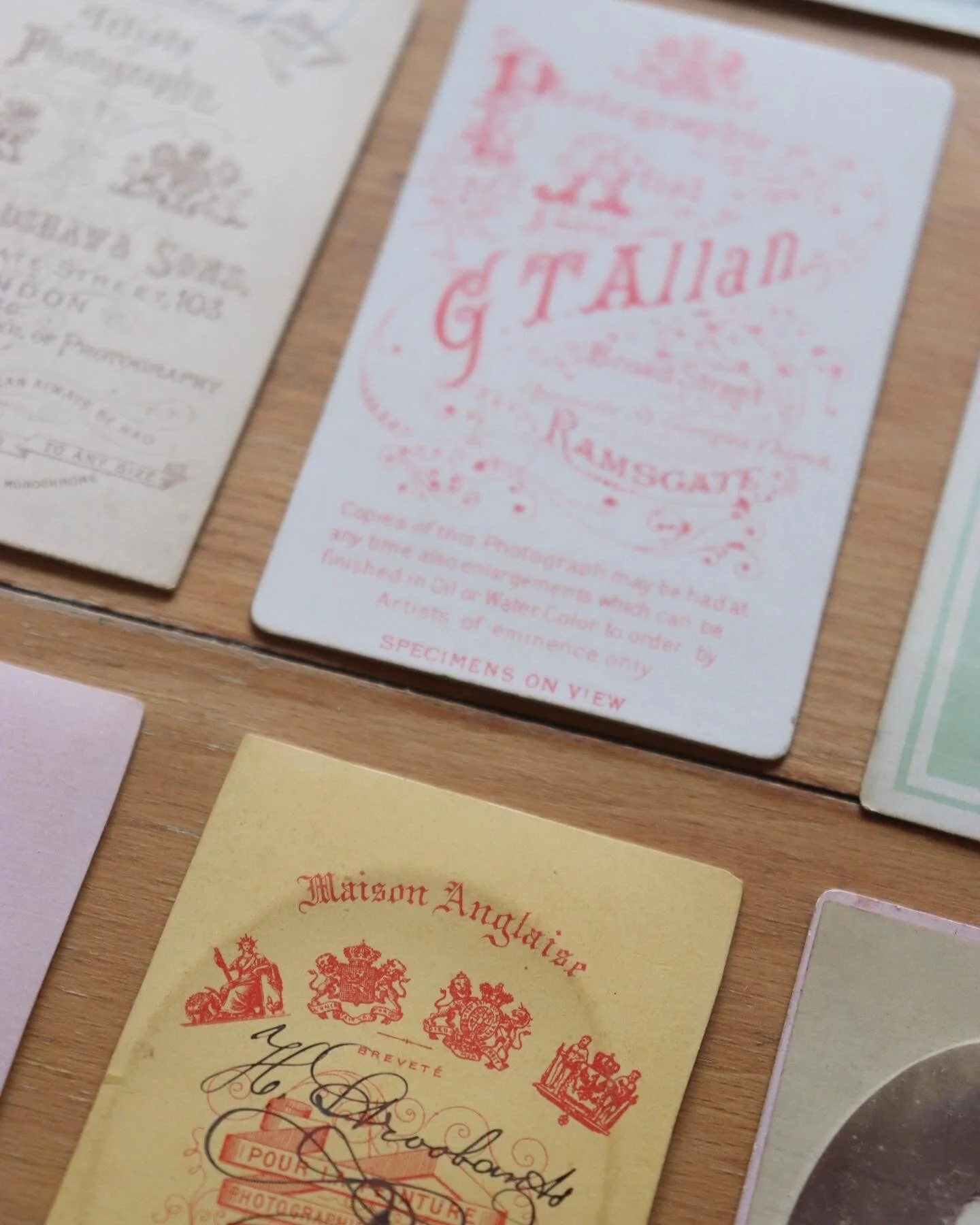
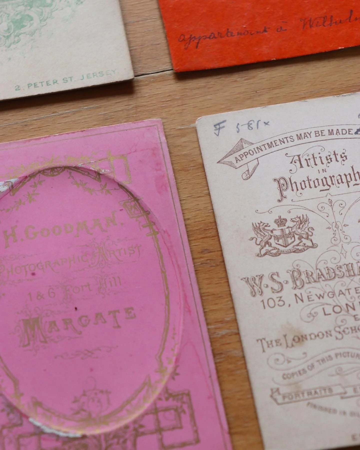
What distinguishes the cabinet card is not the photograph alone, but its mounting. The image is fixed to a stiff card, transforming it into something more durable and more deliberate. This additional layer introduces space for typography, ornament, and framing—elements that sit outside the photograph, but shape how it is read. The object becomes composite: image, text, and material working together.
Typography as identity
The photographer’s name is typically positioned on the front or reverse, often in highly stylised lettering. This is not incidental. It functions as a form of authorship and advertisement, asserting the presence of the maker alongside the subject. Typefaces vary—ornate, condensed, occasionally experimental—reflecting both prevailing styles and individual preference. The reverse, in particular, becomes a site of expression. Decorative motifs, borders, and arrangements of text extend the object beyond its primary function.
Standardisation and variation
Despite their individuality, cabinet cards were produced within a standardised format. Dimensions, materials, and processes were broadly consistent, allowing for mass production. Within this framework, variation was introduced through design—type, layout, and embellishment.This balance between uniformity and distinction is notable. It anticipates later forms of branded print, where differentiation operates within constraint.
Object and memento
Cabinet cards also occupy a dual role. They are personal—portraits exchanged, collected, displayed—but also commercial products, produced in volume and distributed widely. Their design reflects this tension: intimate in subject, but structured for repetition. They are both keepsake and commodity.
Afterlives
By the early 20th century, the format declined, replaced by smaller, more portable photographic forms. What remains is not simply the image, but the object itself. The card, with its typography and material presence, carries as much meaning as the photograph it supports.
In this sense, cabinet cards offer a reminder that design is rarely secondary. Even in its most utilitarian form, it shapes how something is seen, handled, and retained.