Hortus Poeticus
Branding, packaging, website & collateral
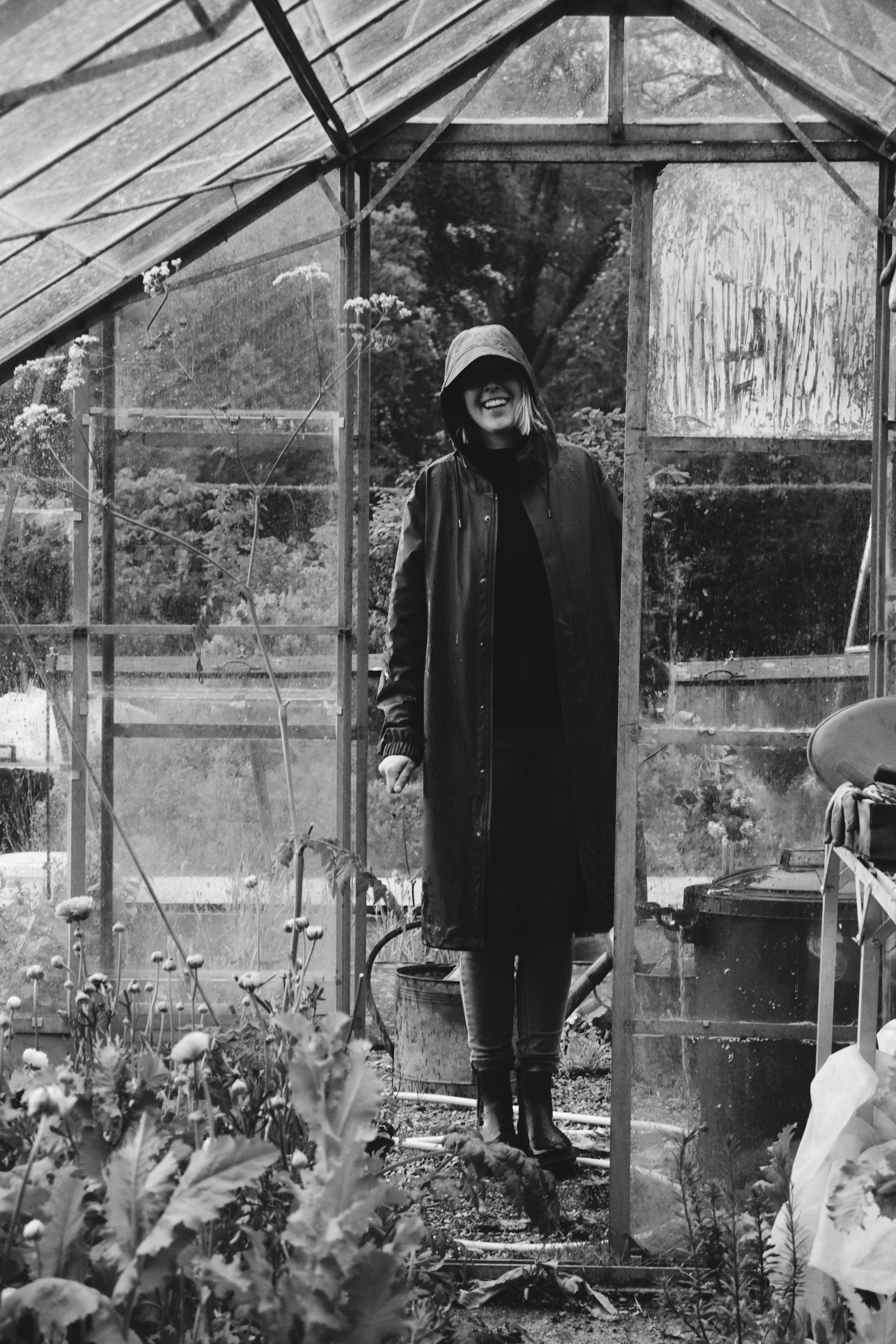
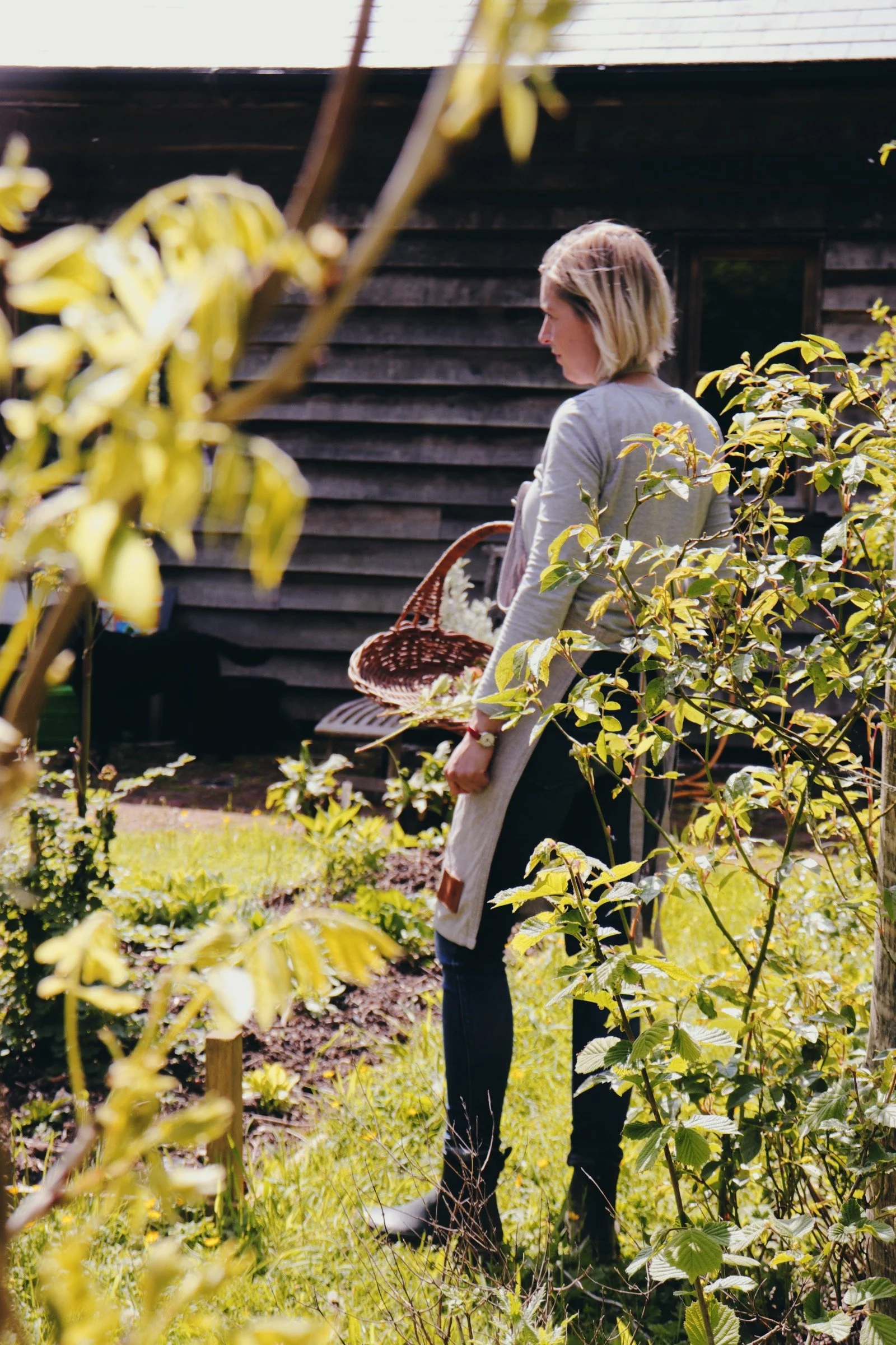
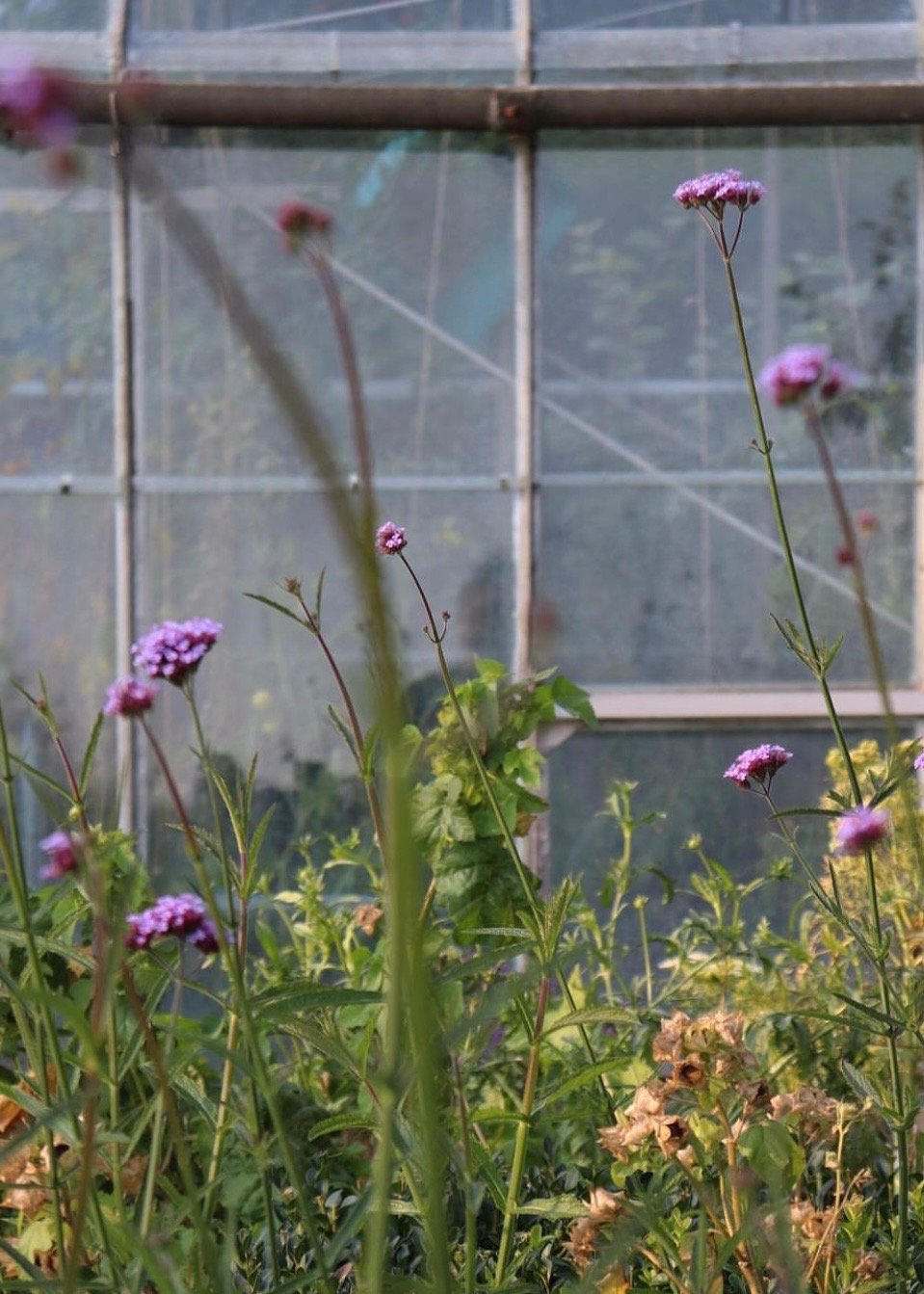
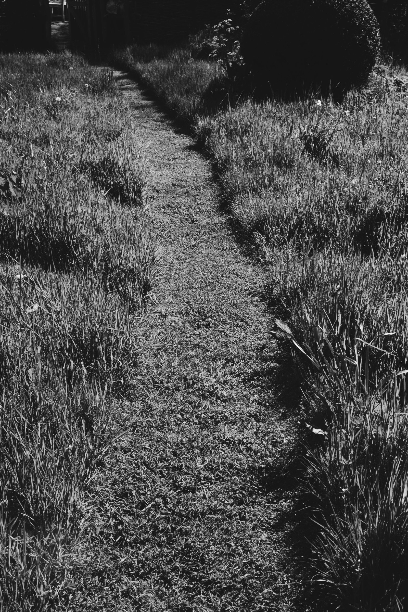
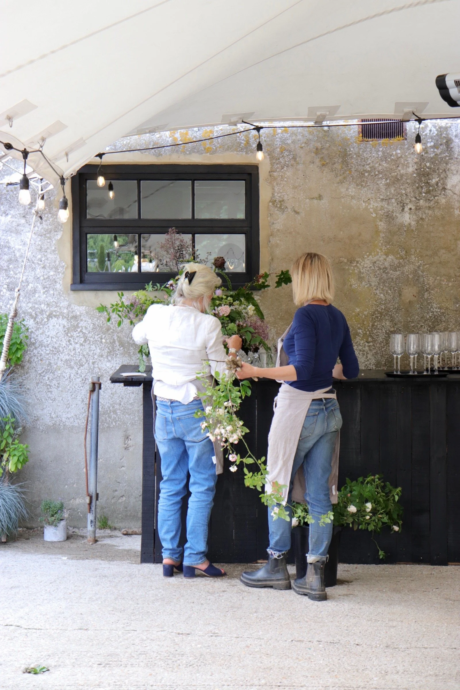
When Gillie and Fi of Hortus Poeticus extended their invitation to collaborate, I knew this would be more than a conventional design project. It allowed me to immerse myself in a philosophy as poetic as the flowers they grow. On visiting their Hampshire farm, nestled in the verdant embrace of the South Downs, I encountered an extraordinary landscape and a profound ethos: a belief in the quiet power of slow, ethical, and intentional craftsmanship.
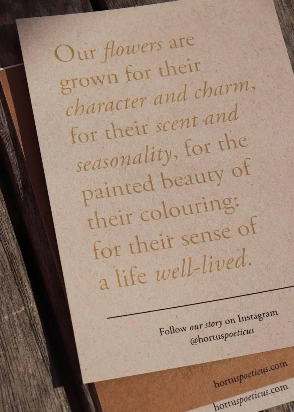
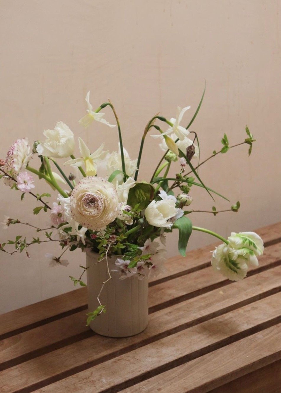
Founded by Gillie in 2019 and joined by Fi two years later, Hortus Poeticus represents a vanguard in sustainable floristry. Their commitment to cultivating English flowers—not merely as a response to the ecological and ethical dilemmas of imported blooms but as an act of reverence for nature—resonates deeply. Their flowers are not products, but narratives layered with seasonality, locality, and care.
A Philosophy in Bloom
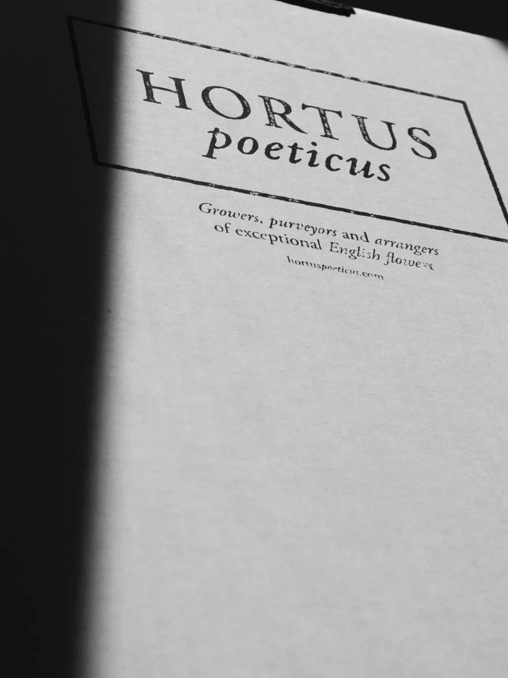
At the heart of Hortus Poeticus is a philosophy rooted in authenticity and artistry. The duo’s ethos—“Growers, purveyors, and arrangers of exceptional English flowers”—is both a mission and a manifesto. It speaks to their reverence for tradition while embracing the ingenuity required to reimagine floristry for our times. This duality became the foundation for the brand’s visual and verbal language, designed to honour the precision and poetry of their work.
The Poetry of Design
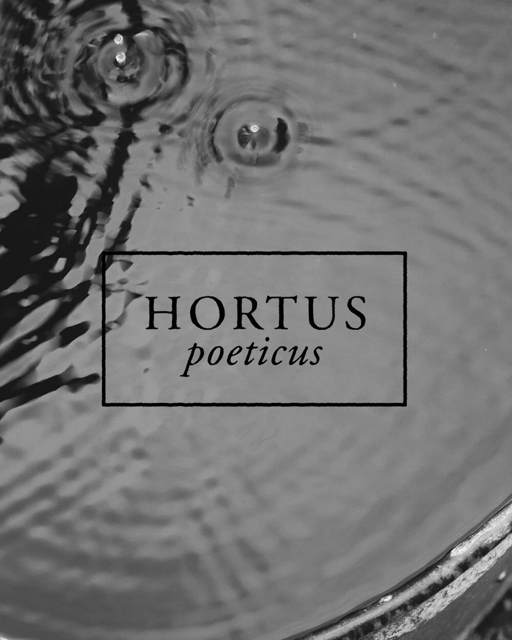
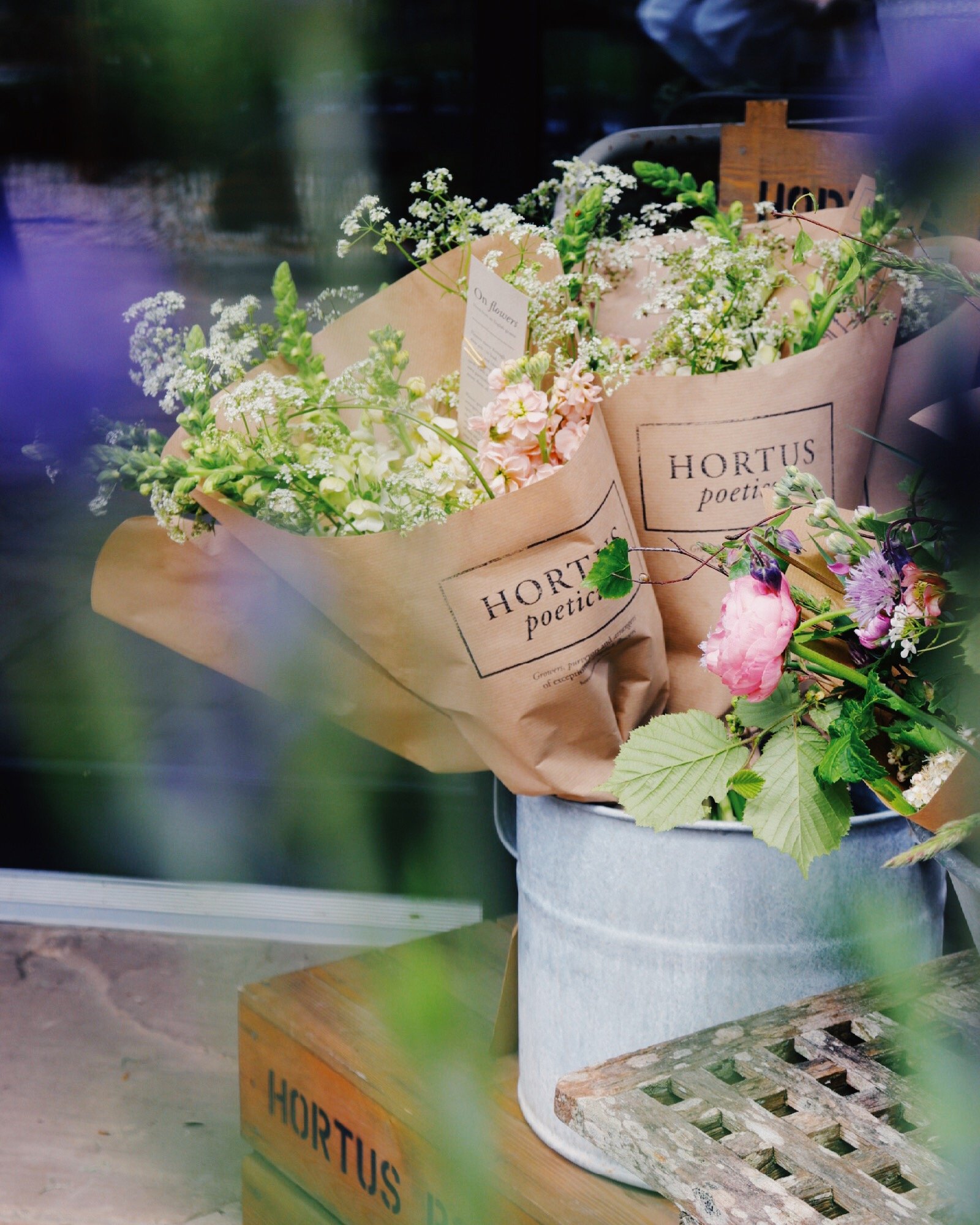
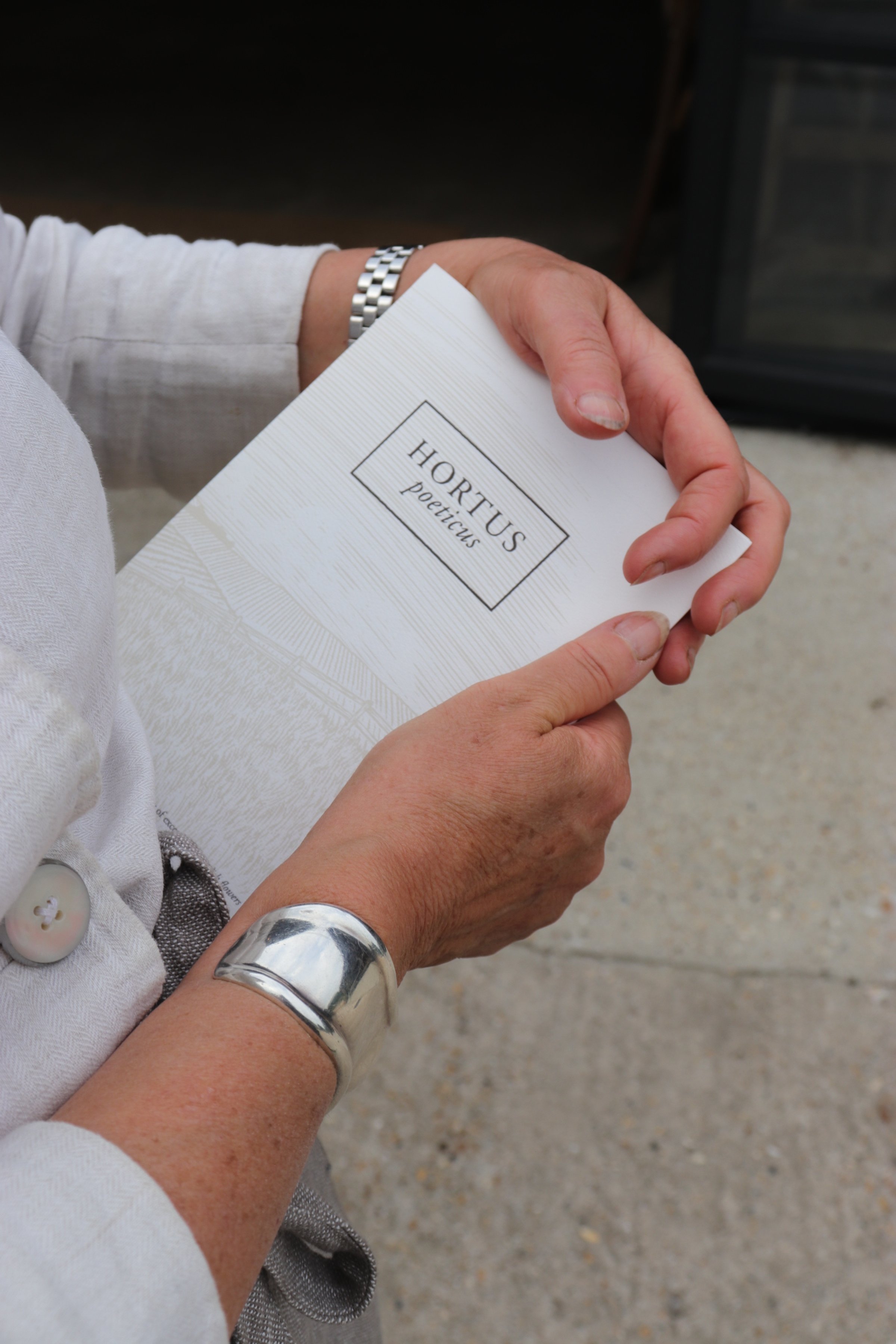
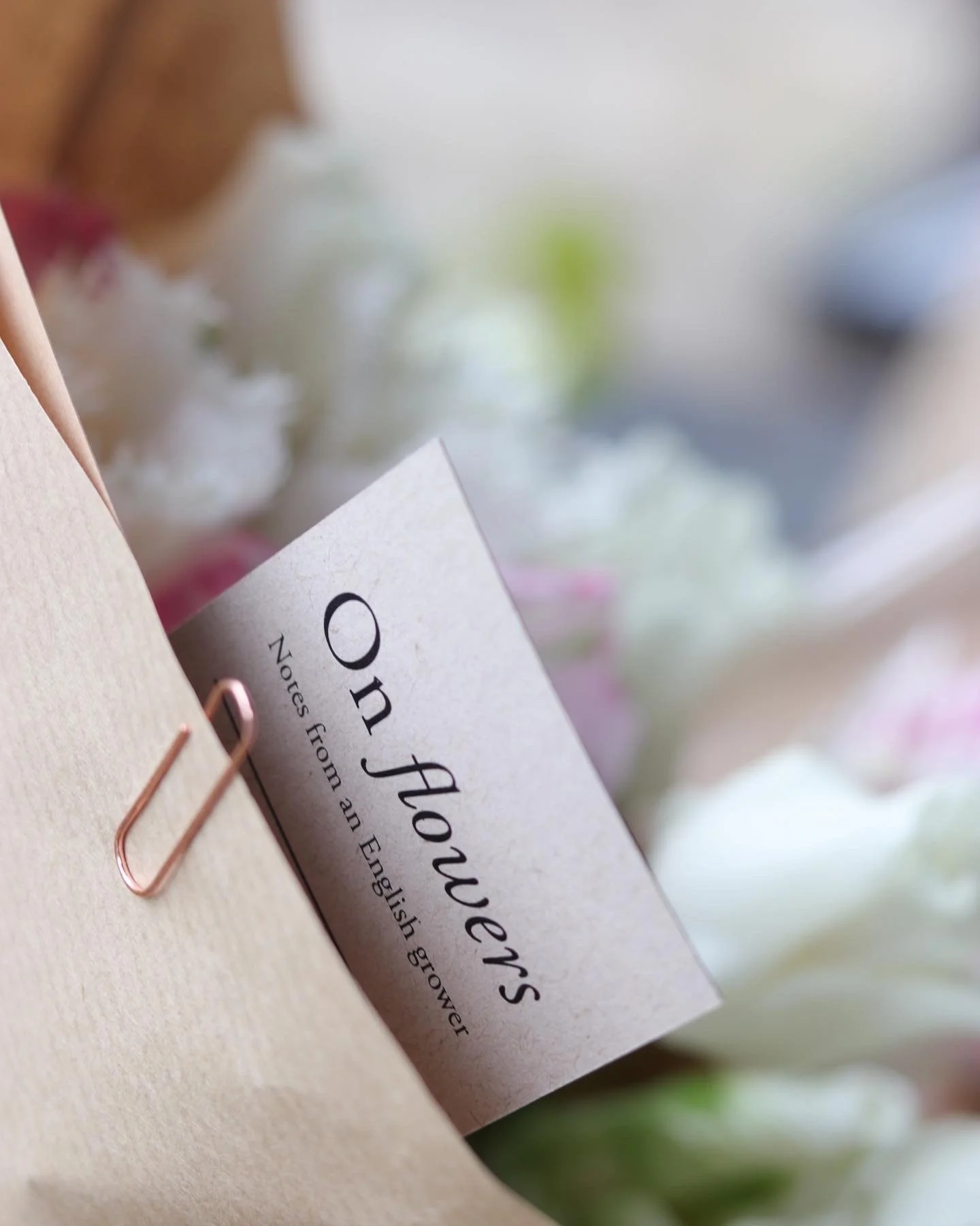
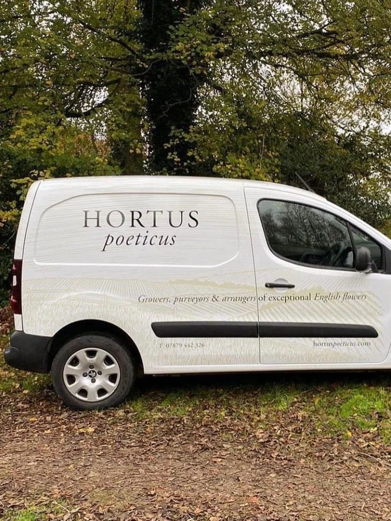
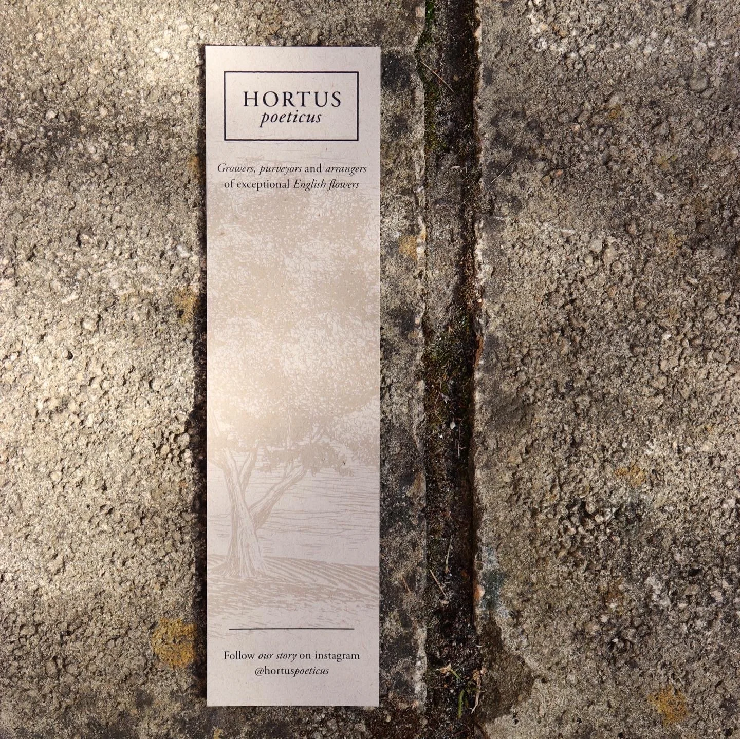
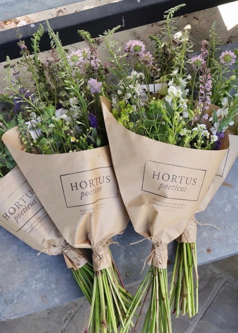
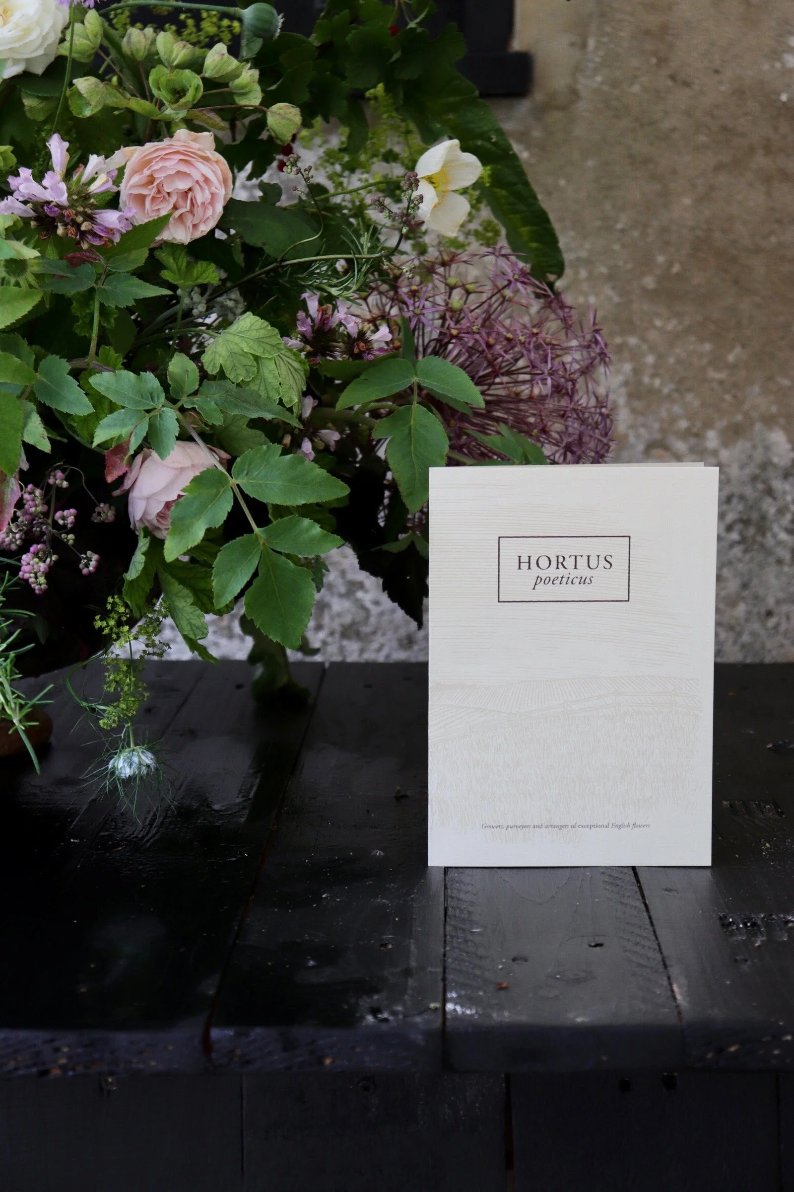
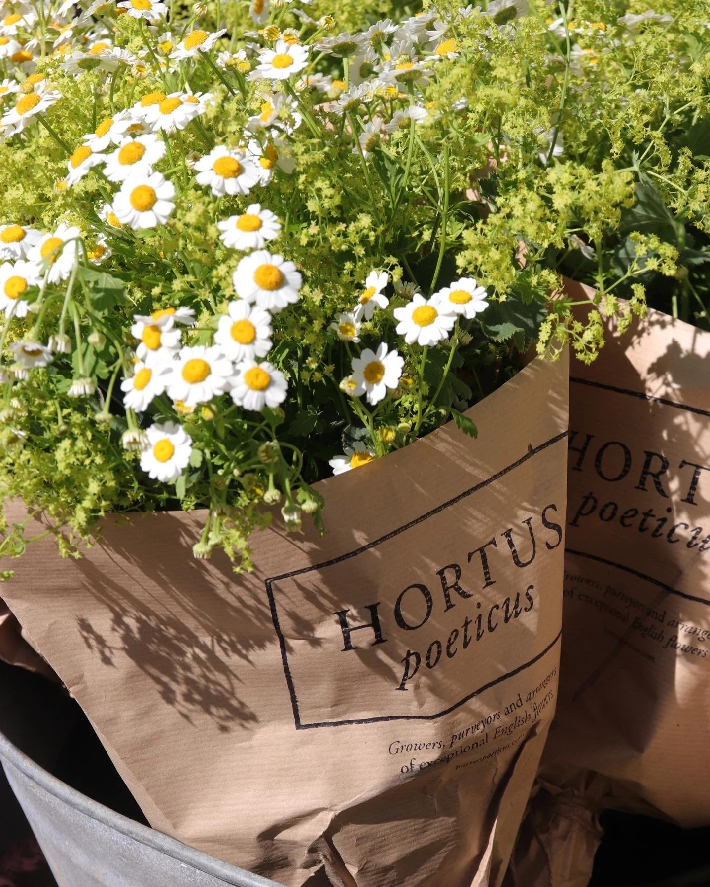
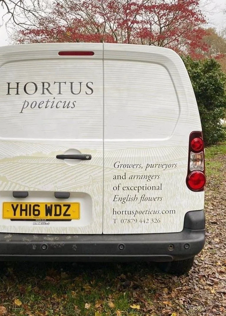
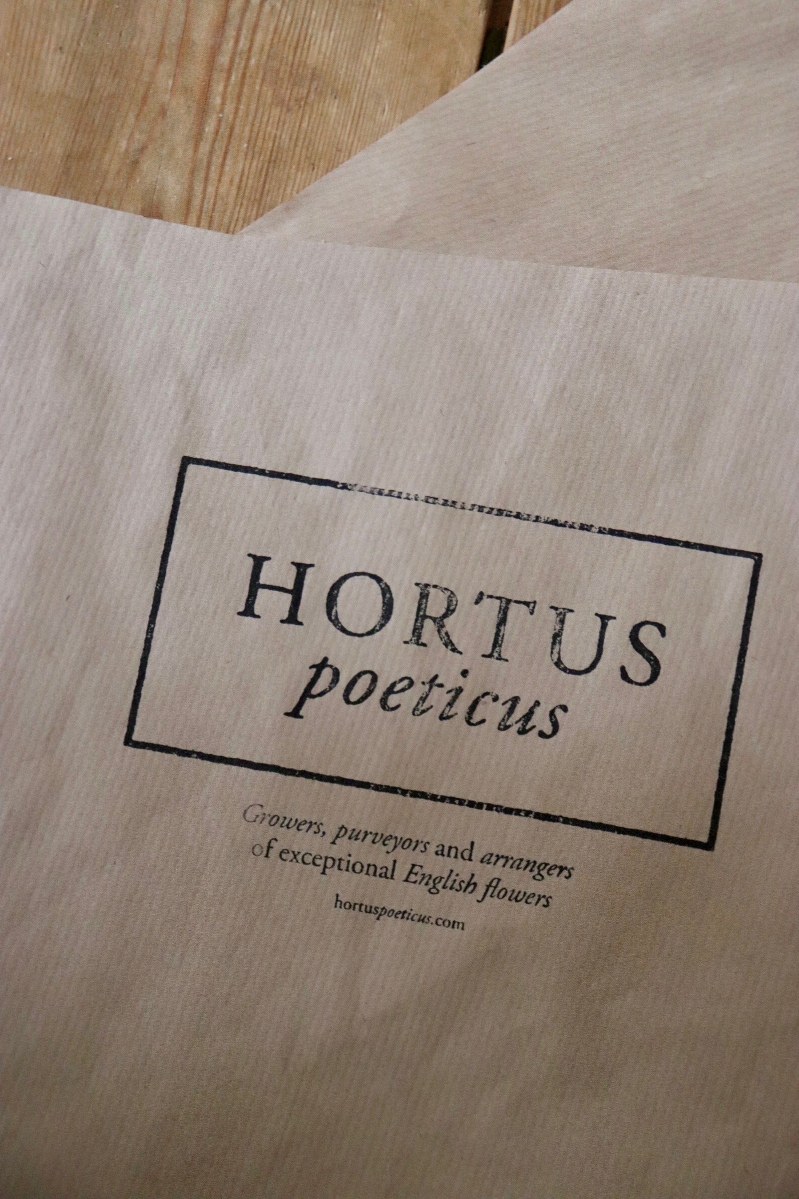
In crafting the brand’s identity, we turned to the traditions of literature, art, and design that resonate so strongly with the spirit of Hortus Poeticus. Drawing inspiration from the typography of antiquarian books and the tactile charm of letterpress printing, we anchored the visual language in timeless aesthetics. The logo—a bold, rectangular frame enclosing a Garamond wordmark—evokes the Latin origins of Hortus, a walled garden, while subtly referencing the structure and integrity of horticultural labelling.
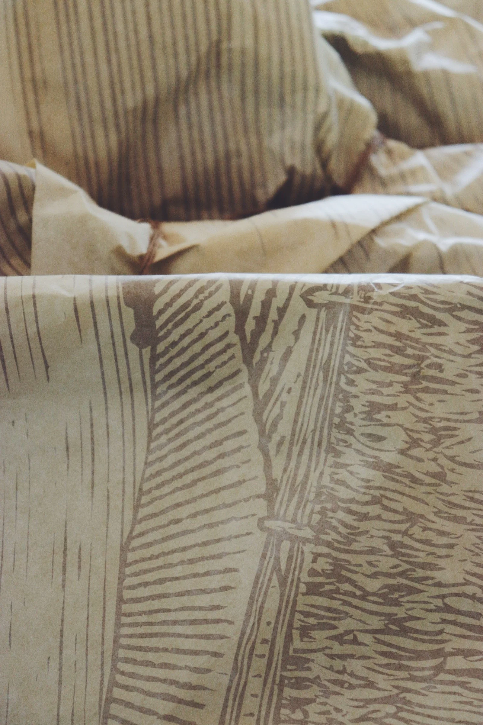
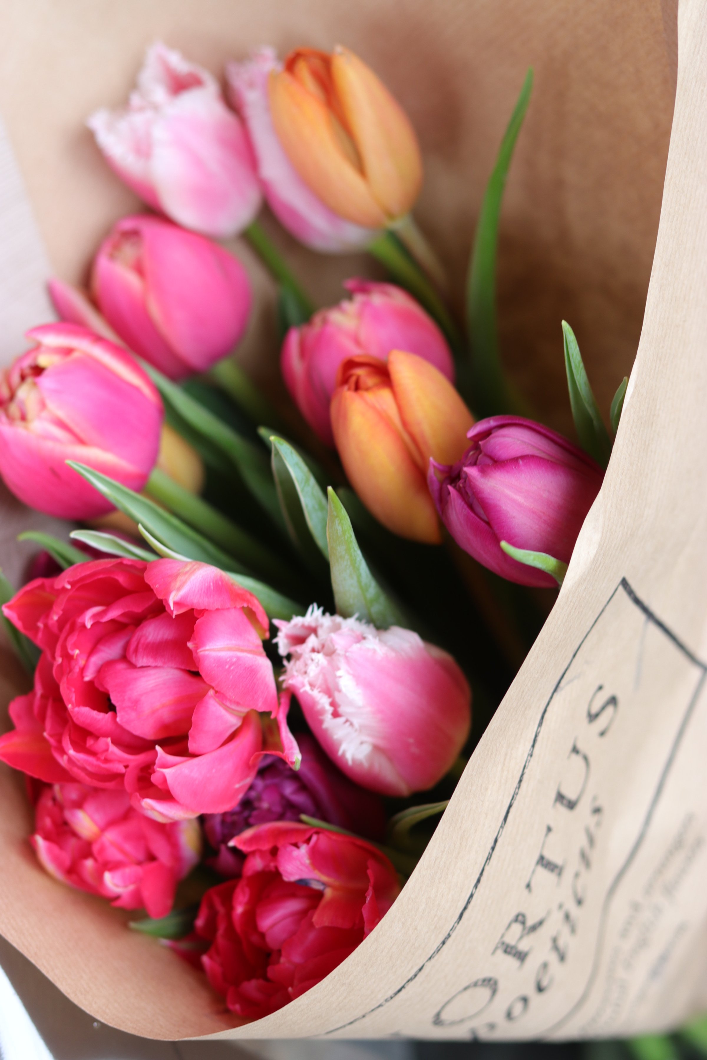
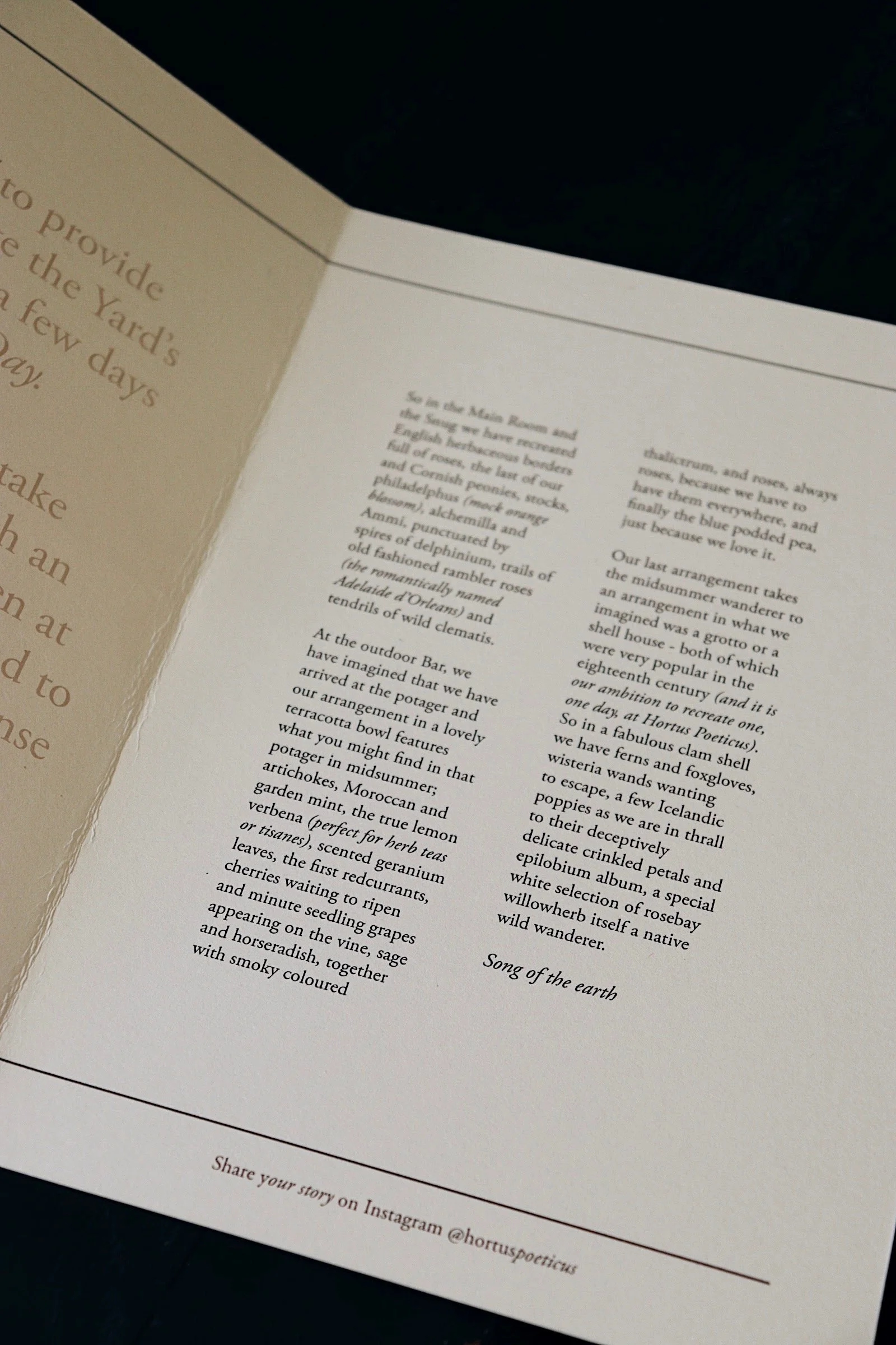
Every detail was carefully calibrated. The bookmark-inspired flower care cards, ex-libris-style packaging, and narrow-column typography echo the craftsmanship of libraries and the intimacy of hand-bound volumes. Even the palette—muted earth tones accented by botanical greens—mirrors the South Downs landscape and the flowers themselves. This synthesis of elegance and intellect offers a counterpoint to the anonymity of contemporary luxury branding, celebrating instead the tactile and the tangible.
A Deep Connection to Place
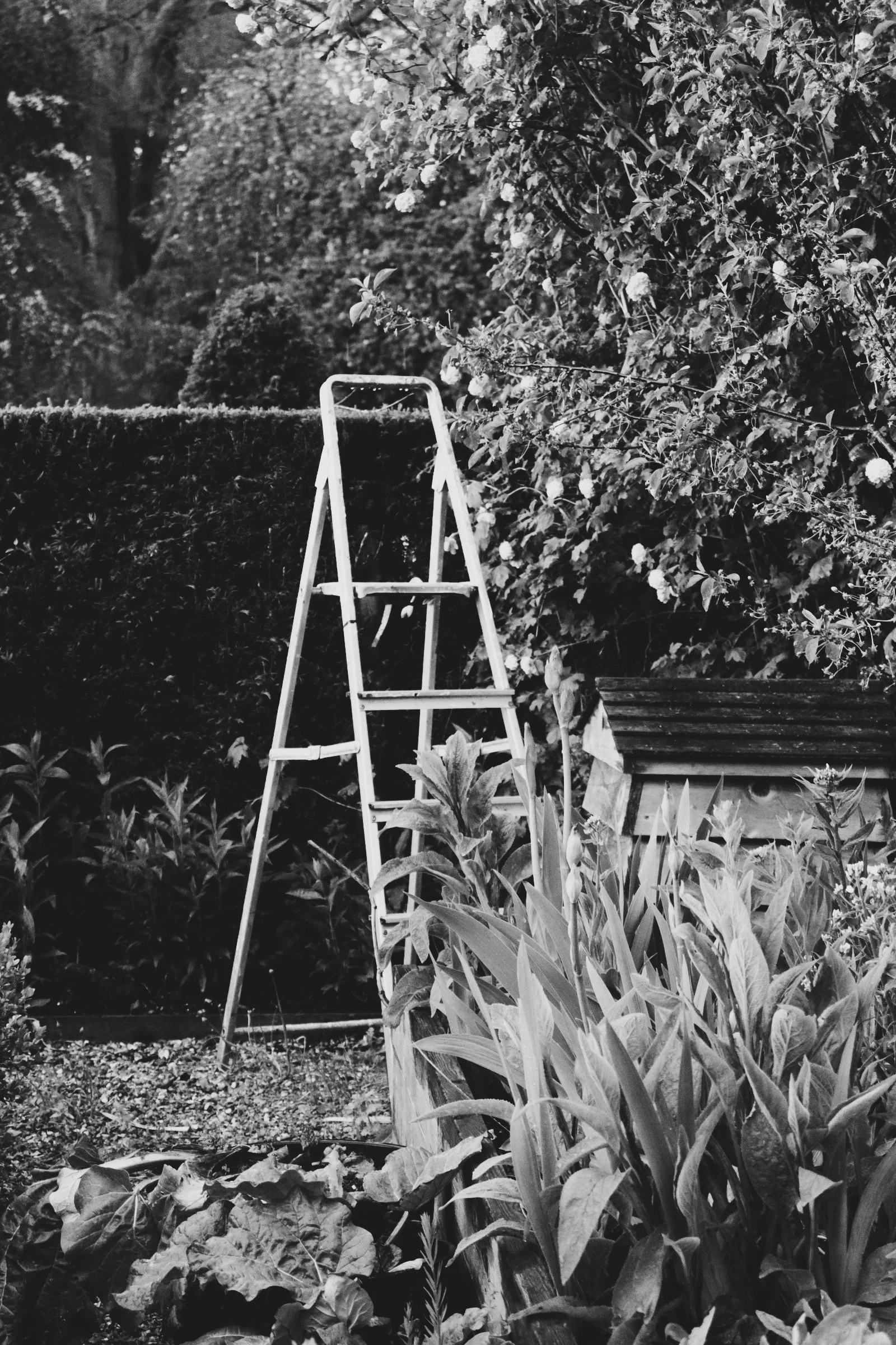
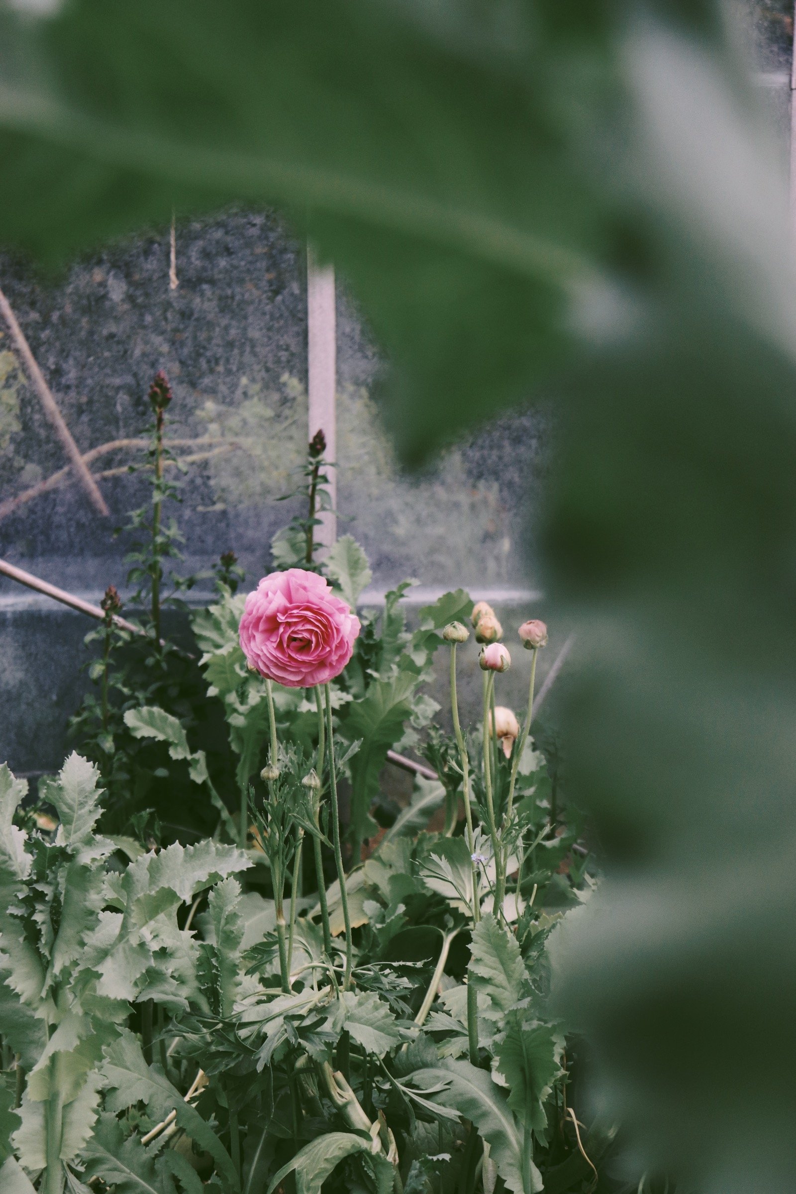
The South Downs, with its undulating contours and chalky soil, is not just the site of Hortus Poeticus but its muse. The farm’s proximity to Old Winchester Hill—a landmark etched with layers of human and natural history—served as inspiration for the woodcut-style illustrations woven into the brand’s visual lexicon. Materials, too, were chosen with intention: compostable packaging and textured papers evoke the tactility of the land, grounding the brand in its ecological commitment.
A Living Narrative
Hortus Poeticus is not static. Like the seasons that define its blooms, it is in perpetual motion. Gillie and Fi’s deep knowledge of floristry's historical and cultural contexts lends their work a rare depth, elevating it beyond aesthetic pursuits to something more cerebral and emotional. Collaborating with them meant engaging in an ongoing dialogue informed by farm visits, conversations about the intersection of art and nature, and the evolving story of their fields and flowers.
Through this partnership, we sought to design a brand and articulate an enduring and alive identity as timeless as the hills that cradle the farm. Hortus Poeticus is, at its essence, a living work of art—its roots planted in the soil, its branches extending into the realms of beauty, history, and sustainability. It invites us to pause, reflect, and marvel at the extraordinary in the everyday.